By Steve Keen, Associate Professor of Economics & Finance at the University of Western Sydney, and author of the book Debunking Economics, cross posted from Steve Keen’s Debt Deflation.
The latest Flow of Funds release by the US Federal Reserve shows that the private sector is continuing to delever. However there are nuances in this process that to some extent explain why a recovery appeared feasible for a while.
The aggregate data is unambiguous: the US economy is delevering in a way that it hasn’t done since the Great Depression, from debt levels that are the highest in its history. The aggregate private debt to GDP ratio is now 267%, which is more than 30% down on the peak level of 298% achieved back in February 2009.
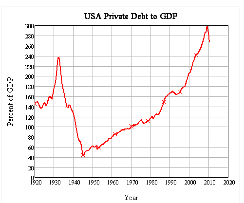
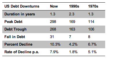
This dwarfs any previous post-WWII experience–even the steep recession of the mid-1970s.
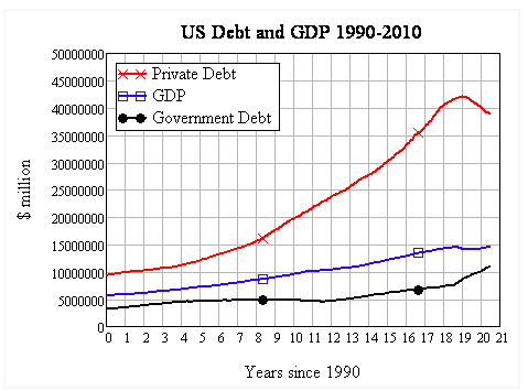
The aggregate level of private debt now towers over the economy, putting into sharp relief the obsession that politicians of all persuasions have had with the public debt. Rather like Nero fiddling as Rome burnt, politicians have focused on the lesser problem while the major one grew out of control. Now they are obsessing about a rise in the public debt, when in a very large measure that is occurring in response to the private sector’s deleveraging.
If they had paid attention to the level of private debt in the first place, then we wouldn’t be facing exploding public debt today.
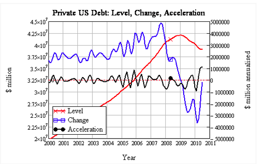
However, though the decline in private debt is steep and continuing, the rate of decline has slowed. Because debt interacts with demand through its rate of change, this has given a stimulus of sorts to the economy in the midst of its deleveraging.
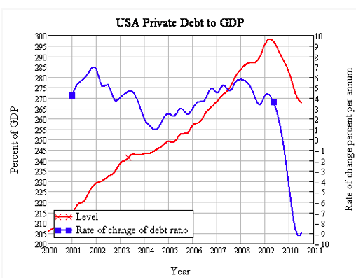
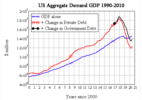
This is obvious when one considers aggregate demand as I define it: the sum of GDP plus the change in debt (where this demand is spread across both goods & services and the asset markets). Though debt levels are still falling, because they are falling less rapidly there has actually been a boost to aggregate demand from debt from the fact that debt is declining less rapidly in 2010 than in 2009:
This is doubly so when the contribution to demand from the public sector is included, as this shorter term graph shows more clearly.
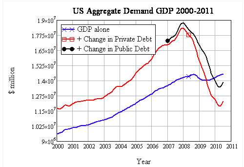
However while recent data shows a positive contribution to demand from debt falling more slowly, on an annualised basis, the change in debt is still subtracting from aggregate demand–and more so than in the previous year. So total demand (across all markets–commodity and assets) had to fall, even though GDP itself grew. Obviously most of the fall in demand has been absorbed by the asset markets, which have not recovered to the same level of turnover as in the boom years–and nor should they.
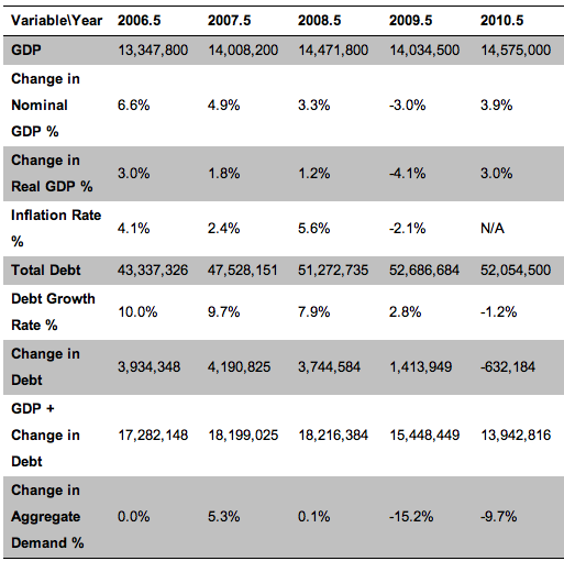
The next table, which uses the aggregate debt figure (public and private debt combined) from the Flow of Funds, shows that aggregate demand fell across July 2008 to June 2009, even though debt was still rising, because the rate of growth of debt fell from $3.7 trillion to $1.4 trillion. Across July 2009 to June 2010, the decline in aggregate demand was less than the previous year (a 9.7% fall versus a 15.2% fall), even though the change in debt had turned negative.
The rise in aggregate demand supported a recovery in employment, but the prospects of this continuing to the point at which economic activity booms once more are remote: with debt levels as high as they are, the potential for further deleveraging still exceeds the worst that the US experienced during the Great Depression.
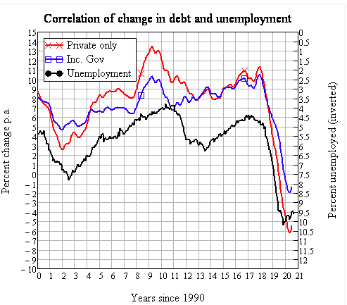
I have recently become aware of some other economists using a similar concept to my measure of the debt contribution to aggregate demand, which they call the “credit impulse” (Biggs, Mayer et al., http://ssrn.com/paper=1595980). They define this as the change in the change in debt, divided by GDP.
My definition emphasises aggregate demand and correlates this with the level of employment (or unemployment, as above), whereas theirs emphasises the change in aggregate demand and correlates with changes in the level of employment. The logic is identical, but has the advantage of being able to correlate the change in the change in debt with change in employment. It highlights an apparent paradox: the economy can receive a boost from debt, even though it is falling, if the rate of that decline slows.
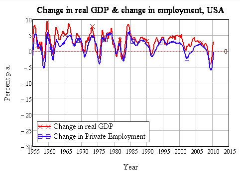
The next few charts apply this concept using the recent Flow of Funds data, and shows why it is so important to consider the dynamics of debt when trying to understand why this downturn has been so severe—and why it also seems to have eased. Firstly, change in employment and change in real GDP are obviously correlated, and on this basis this downturn is bad, though not significantly worse than previous downturns in 1958, 1975 and 1983.
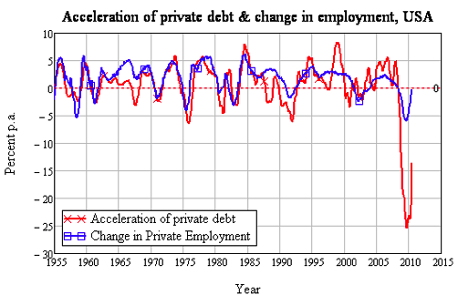
However when you consider the correlation between the “credit impulse” and the change in employment, this crisis has no precedent in the post-WWII period:
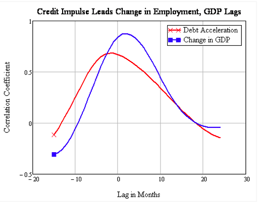
Furthermore, debt is the leading factor is this process. Though the correlation between changes in real GDP and changes in employment are higher than those for the acceleration in debt and changes in employment, the “credit impulse” leads changes in employment while GDP slightly lags changes in employment: credit, which is ignored by conventional “neoclassical” economics, is in the driving seat.
This is something that Keynes realized after writing the General Theory (Keynes 1936), but which never made its way into the textbook version of Keynes that conventional economists like Stiglitz and Krugman learnt as Keynesianism.
Planned investment—i.e. investment ex-ante—may have to secure its “financial provision” before the investment takes place; that is to say, before the corresponding saving has taken place. This service may be provided either by the new issue market or by the banks ;—which it is, makes no difference… let us call this advance provision of cash the ‘finance’ required by the current decisions to invest. Investment finance in this sense is, of course, only a special case of the finance required by any productive process; but since it is subject to special fluctuations of its own, I should (I now think) have done well to have emphasised it when I analysed the various sources of the demand for money. (Keynes 1937, pp. 246-247)
The good news in the latest Flow of Funds data is therefore that a slowdown in the rate of deleveraging can impart a positive impetus to employment. However the bad news is that the economy is now hostage to changes in the rate of deleveraging, from levels of debt that far exceed anything it has ever experienced beforehand. Since much of this debt was taken on to finance speculation on asset prices rather than genuine investment, it is highly likely that deleveraging will accelerate in the future, as speculators tire—literally as well as metaphorically—of carrying large debt loads that finance stagnant or declining asset prices.
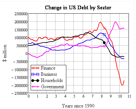
Drilling down into the debt data, it’s apparent that the sector that caused the crisis—the finance sector—is the one that has delevered the most is also the one whose rate of delevering is slowing most rapidly.
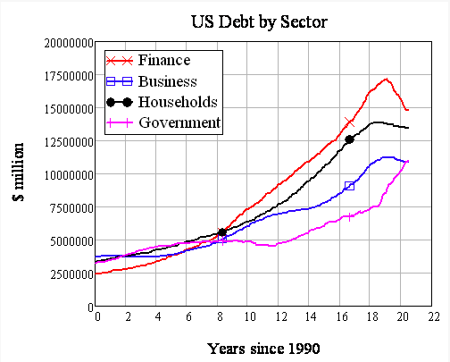
This is not a good thing, nor is it likely to last. The finance sector exists to create debt, and the only way it can do that is by encouraging the rest of the economy to take it on. If they were funding productive investments with this money, there wouldn’t be a crisis in the first place—and debt levels would be much lower, compared to GDP, than they are today. Instead they have enticed us into debt to speculate on rising asset prices, and the only way they can expand debt again is to re-ignite bubbles in the share and property markets once more.
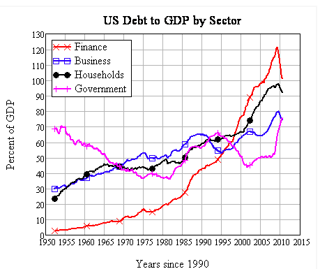
Here’s where the level of debt (when compared to income) matters, as opposed to its rate of change: reigniting these bubbles is easy when debt to GDP levels are low. But reigniting them when debt to income levels are astronomical is next to impossible. Speculators have to be encouraged to take on a level of debt whose servicing consumes a dangerously high proportion of their income, in the belief that rising asset prices will let them repay that debt with a profit in the near future.
With the debt to GDP levels for all non-government sectors of the American economy at unprecedented levels, the prospect that any sector can be enticed to take on yet more debt is remote. Deleveraging is America’s future.


I’m intrigued by this as opposed to the last deleveraging post that asserted that, “Americans are not deleveraging, they are going one one last binge.” From looking at the numbers, it seems that the deleveraging is indeed occurring, though much more slowly than is stated in the media or is widely accepted, yes?
Yeah, see my comment below—I thought there was a post claiming that we’re not deleveraging much but rather just seeing debts written off.
Thanks.From looking at the numbers, it seems that the deleveraging is indeed occurring, though much more slowly than is stated in the media or is widely accepted, yes?
Steve Keen can put forward a cogent argument from an academic point of view but has a strong track record of an inability to comprehend the real world, e.g. http://www.smh.com.au/business/property/keens-long-march-to-lower-house-prices-20100414-sdn0.html
@Pete…
http://www.news.com.au/money/property/lenders-throwing-cash-at-buyers/story-e6frfmd0-1225918973988?area=money
http://www.scribd.com/doc/29520921/How-to-Profit-From-the-Coming-Aussie-Property-Crash-and-Banking-Crisis
http://www.abs.gov.au/AUSSTATS/abs@.nsf/Lookup/72A5703726A305B8CA25773700169C7C?opendocument
http://rwer.wordpress.com/2010/05/13/keen-roubini-and-baker-win-revere-award-for-economics-2/#more-1247
http://www.debtdeflation.com/blogs/2010/09/15/more-on-the-commonwealth-bank/
35PETER_W
September 12th, 2010 at 1:22 pm
These are the lending figures presented by AFG who claim they arrange ~10% of all housing loans in Australia
JUN10 Loan Sales: 6,159 Average loan size: $377,233 LVR ratios: 61.6%
Therefore the appraised price/settlement price was = $612,391
JUL10 Sales: 5,698 Average loan size: $370,505 LVR ratios: 62.4%
Therefore the appraised price/settlement price was = $593,758
AUG10 Sales: 6,269 Average loan size: $373,750 LVR ratios: 63.0%
Therefore the appraised price/settlement price was = $593,253
AFG do not provide income or serviceability but they do have this information. The reliable public information we can access is from the ABS ~ $1256.30 week = $65,327.60 p.a.
Price to wage ratio is ~ 9.1
—–
Skippy here, if you need more info I have a ton of it. On another note the same low near nil down payment scam is making its rounds down here. Vector that into the down fall in the northern hemisphere RE collapse.
My personal Favorites see:
We also note however they are not alone in their desire to “represent” Australian property in a much kinder way. Yesterday we were sent an e-mail from a reader, Andrew, who was nice enough to supply us with GoldMan Sach’s latest report explaining that there is no Oz housing bubble. This report was referred to in this Business Spectator Article.
Now we know we have heard all of this before , and that GS was telling everyone in the US the same thing while secretly betting against it. We wonder if they are up to the same trick again? Maybe this is a sign to panic?
http://delusionaleconomics.blogspot.com/2010/09/oz-real-estate-and-desperate-banks.html
This ones golden!
http://www.news.com.au/money/property/yellow-brick-road-removes-proof-of-savings-in-home-buying-applications/story-e6frfmd0-1225912093936
Skippy…ring a bell to ya?…yellow brick road lending…ROFLMAO
http://delusionaleconomics.blogspot.com/2010/09/oz-real-estate-and-desperate-banks.html
http://www.news.com.au/money/property/lenders-throwing-cash-at-buyers/story-e6frfmd0-1225918973988?area=money
My personal favorite see:
http://www.news.com.au/money/property/yellow-brick-road-removes-proof-of-savings-in-home-buying-applications/story-e6frfmd0-1225912093936
Skippy…yellow brick road leanding ROFLOL.
whatever, predicting markets includes timeframes. Any beginner trader learns you may be right long term but wrong on the short term etc. “real world” is complex and those who pass judgment on others for failing to predict “real world” on a given date are either 1/ idiots 2/ disingenuous themselves. Go hide under a rock and come back when the price of housing has fallen back to earth in oz. Sheesh.
Leaving aside that the government rolled out massive support programs, Keen hasn’t even lost. He said it’d take 10-15 years before it fell 40%, the other guy said “I’ll give you 5,” Keen said “whatever” then after they rose Keen was declared the “loser.” Instead of complaining about the switch in terms Keen walked with a bunch of new friends and raised money for the homeless.
So no it’s not a strong inability to comprehend the real world, it’s a product of infantile braggarts and press that are again diminishing the people that actually understand anything until we’re all back down in the sewer.
The fact that the government intervened is a perfect example of Keen’s lack of understanding about the real world. The housing market does not operate in a vacuum – a housing crash is certain political death, just look at the UK, not to mention the impact it would have on the Australian banking sector and all the flow on effects that would imply. You better believe the government of the day and the RBA won’t sit by idly and let it happen. Governments manipulate the markets all the time, through stimulus measures, tax policy and the occasional direct intervention. One can’t disregard this just because it doesn’t fit their economic model.
If you take Sydney the problem is a fundamental one of supply vs demand. There’s plenty of affordable housing, it’s just too far away from where people want to live. That is why people pay a premium for their houses and have consistently done so for 20 years. Please find me a time in recent history when quality Sydney property has been affordable.
For there to be a crash of Keen proportions across the board, you would have to have a lot of people forced to sell and for there to be no buyers. The only way that could manifest is through was widespread unemployment at all levels, as a symptom of total economic destruction in Australia. Otherwise they will just sit on their houses, as they need places to live anyway. And last time I checked the Australian economy was doing pretty well, on both an absolute and relative basis.
Property could well be a bubble but there are a lot of factors at play, if you look at supply/demand to forecast a such a fall seems blinkered. At worst there will be a lengthy period of price stagnation, as Sydney and other parts of Australia have experienced before.
“…This is something that Keynes realized after writing the General Theory (Keynes 1936), but which never made its way into the textbook version of Keynes that conventional economists like Stiglitz and Krugman learnt as Keynesianism. …”
That’s hit ’em for six!
I cannot help thinking that looking at the aggregate leverage position is misleading. What I suspect is happening is that parts of the economy are de-leveraging and parts levering up. On the consumer side I see a mix of actions, with forced de-leveraging, credit card pay downs, increased saving for retirement and insecurity about taking debt on one side and on the other no real change in consumer ideals, spending due to delayed foreclosures and the recently mentioned one last splurge. Net I expect forced de-leveraging and high credit card costs are key and will not abate until the housing market rebounds.
Small businesses I guess are also de-leveraging, but I don’t see that much evidence that big business is. More likely they see this as a opportunity to expand and after all they escaped relatively easily in the recent downturn. In finance I see areas where leverage is reducing and other areas where it is increasing very quickly. I recently inquired about Hire purchase rates and personal contract plan rates in relation to buying a car and was surprised to note that personal contract plan rates were lower than hire purchase rates. Even though hire purchase is probably the safer for a lender it reduces their ability to lever the assets. You also have to look at the chase for yield and the amount of leverage used.
There does not appear to me a uniformity to leverage and making conclusions based on that might be dangerous. Increased volatility could quickly hit those that are leveraging up and turn things into a right mess again. My worry is that bubbles are much harder to spot in a general de-leveraging environment and could grow into a destabilising size.
Steve,
1/ thanks for this article and pointing out that GDP is impacted by the second derivative of monetary levels. That is a new one for me and something to think about. I have downloaded the paper you reference and I hope it covers that in detail. A bit of background on that crucial point and in your words would be appreciated though.
2/ It was your opinion in “not keen about bailouts” that public spending couldn’t match private deleveraging. It seems to be the case (still global deleveraging in spite of QE) but we have avoided a catastrophic unwind/run so far. Is public spending to thank for that, or are markets that stable (stable == deleverage in semi-equilibrium)
In reading the paper you referenced and In retrospect (hindsight 20 20 and bla bla) it is trivial from a dimensional analysis standpoint.
GDP is a flow of new things (things/year).
The flow of credit is new credit per year.
New credit goes to new things (GDP). Credit stock goes bad but that is accounting entries and bad debt write off in banks.
I also find their model contrived and mostly wrong in the current environment (they assume new investment is from debt) when companies are currently flush with cash. Clearly they claim “no causality” and I am curious to know if it holds in the current environment.
Final point for me, is that I find it very disturbing that this point is made in 2010 referencing research from 2006 and Bernanke’s own papers. I mean dimensional mismatch is bad. Proves economics has a way to go in mainstream to achieve some semblance of rigor.
Great paper though, food for thought.
re: “companies are currently flush with cash”
The large majority of that “cash” is actually holding of short term debt – the debt of other companies. So it represents money that has already been spent. Think of it this way: For a company holding $1B in “cash equivalents” that are actually debt to use that $1B to make a real investment, they must sell the debt to another party. So some other party with actual “cash” or new credit must step forward to fund the investment though the purchase of this “cash equivalent” debt.
Judging by the last graph, It seems that deleveraging is a largely a myth. The only sector that has significantly delevered is Finance and that is more than matched by Government (probably reflecting Govt support to the financial industry).
Since we’re looking at this in aggregate, we could theoretically apportion the Government debt to the household and business sectors (according to their proportionate tax responsibilities). When looked at that way, Households (and all businesses other than Finance) have been forcibly levered to even higher levels thanks to “private gains, socialized losses.”
Yes, this data backs up the contention that the effect of the interventions into the economy has been to transfer bad debt from banks to government. I haven’t looked at the details, but I suspect the most significant mechanism has been GSE refinances of houses at inflated prices. That’s a particularly useful mechanism to dump losses on the public because the banks benefitting from the largesse can claim innocence because they got little in *direct* transfers. The guarantees and swaps which aroused so much furor (and which have largely been unwound) were merely bridging mechanisms for this more insidious fraud.
I think some of the x axis scales are mislabeled on at least three of the charts provided above.
Specifically:
Chart of US Aggregate Demand GDP 1990-2010: the x-axis legend “Years since 2000” should be changed to “Years since 1990”.
Chart of Change in US Debt by Sector: the x-axis legend “Years since 1990” should be “Years since 2000”.
Chart of US Debt to GDP by Sector: the x-axis legend “Years since 1990” is superfluous.
If I am wrong about these points, somebody please correct me. But since I think that what Keen is saying is very important, I want to make sure that there is no confusion regarding the charts he presents in support of his argument.
Excellent post.
I thought there was a post or link here in the past couple days that showed pretty conclusively that American households have “truly” (i.e., via saving and paying down debt) deleveraged very little; most of the apparent deliveraging is actually through banks etc writing off bad debt.
Probably and point is that only new flow goes to new things. So writing off bad debt (aka deleveraging) is just a recognition that the assets produced with past debt (and captured in a past GDP) were not worth what we thought they did. But current activity is only linked to new flow. I suspect there is a link from stock to new flow in the form of Basel regulation but the point from the paper referenced is well taken.
“I thought there was a post or link here in the past couple days that showed pretty conclusively that American households have “truly” (i.e., via saving and paying down debt) deleveraged very little;”
That was the conclusion, but George Washington has no data to back it up. The Flow of Funds data does not tell you how much debt has been retired (or how) versus how much has been extended.
In any event, how are people in the bottom 90% of households supposed to deleverage by saving and paying down debt when most of them live paycheck-to-paycheck and have a debt-to-wage ratio on the order of 3-to-1? (You can derive this ratio for 1998-2007 using data provided by the Fed, the IRS and a study performed at Cal; I suspect that if we were to break out the total consumer debt by income level, the top 5-10% haven’t changed their habits, but everybody else has).
2.4% total private sector deleveraging. $22 B of it by paying off loans or less than 1%. Keen is right, 10-15 years. Basil 3, a decade away. Tells you all you really need to know.
The Debt-to-GDP ratio is even worse when you strip out the imputations used by the BEA to inflate the GDP number.
Also, at least for the household sector, I think the Debt-to-Wage ratio is a better metric of willingness to borrow. Mucking around with the data (what little there is available; I prefer the IRS data over the BEA data, which is political), it seems that the top decile of households maintains a median debt level equal to roughly annual wages, while the bottom 90%’s debt-to-wage ratio keeps increasing.
“…it seems that the top decile of households maintains a median debt level equal to roughly annual wages, while the bottom 90%’s debt-to-wage ratio keeps increasing.”
That has been the experience for lo these past decades, hasn’t it?
I also wonder, as does Fair Economist above, how much of the household debt is due to inflated housing prices. Housing has just gone over the cliff, and not just over the past five years, at least in my experience anecdotally. When I first graduated from high school and moved out on my own in the mid 1980s, a cheap apartment in an OK part of town was about a week’s wages. Now it’s about two weeks or more. Same with mortgages.
(Of course, the stagnation in real wages is also a big factor, I’d posit.)
Yet really digging into the debt itself and discovering that housing has been a big problem for decades might put paid to the popular plutocrat notion that Americans are just a bunch of profligate mall walkers living it up buying toys….
“I also wonder, as does Fair Economist above, how much of the household debt is due to inflated housing prices.”
Check out Table D.3 of the Z.1 Flow of Funds Report from the Federal Reserve. I’ve compiled the debt data back to 1952. From 1952 until about 1979, mortgage debt tended to be around 2x-2.5x consumer credit. Starting in 1980, that ratio started hovering around 3x, and by 2005 the ratio was at 4x, where it stands today.
If you wanted to quantify the increase in debt due to inflated housing prices, you definitely could. Qualitatively, though, the Flow of Funds data confirms the effect.
“The finance sector exists to create debt, and the only way it can do that is by encouraging the rest of the economy to take it on.”
Is this really true? I mean in a reasonably functioning economy credit/debt facilitates exchange and growth. But in a paper economy you have players who can borrow at ZIRP. Markets can be bid up at very little cost. Sure they aren’t back at their previous highs but they are still overpriced by at least a third that gives lots of wiggle room and opportunities for churning and collecting fees.
Keen seems not to be making a distinction between the real and paper economies. The real economy is sinking. The paper economy is being kept inflated by the ZIRP, and now Bernanke is making noises about another round of QE. I don’t see this having any positive effect on the real economy. It might not even goose the paper economy that much, but it could keep the paper economy alive for that much longer.
The phrase “more than 30% down on the peak level” is misleading as it appears, at least in American English. The current number is down 30 percentage points (on a scale that does not run from 0 to 100). Or, the current number is down a bit over 10% relative to the peak (assuming zero is the bottom of the scale). Or total private debt is down by some amount around 7% of the Feb 2009 value. But there isn’t anything in the chart that’s “30% down”.
I guess there’s a reason mathematicians dislike words and prefer their own brand of hieroglyphics. But as an engineer I can tell you the real secret to quantitative understanding – look at the pretty pictures!
Steve Keen, thank you for some damned insightful analysis.
Everything you say makes sense, and I’m going to look into this further.
Thanks Steve Keen!
I will be sharing this with as many folks as possible.
It seems that the missing part of the puzzle is the real monetary supply numbers… My guess is that if you control that then you at least have a guiding hand in the direction of asset prices (and/or) the rate of change in the deleveraging process.