This is Naked Capitalism fundraising week. In our fundraiser last year, nearly 1000 donors invested in our efforts to shed light on the dark and seamy corners of finance. Join us and participate via our Tip Jar or read about why we’re doing this fundraiser and other ways to donate, such as by check, as well as our current goal, on our kickoff post.
By Lambert Strether.
Readers, we’ve made a number of improvements to navigation and the overall experience of commenting at Naked Capitalism, and we’re proud of them (and a hat tip to our new tech person, Tony). We’ve tested them, but we need the collective feedback of the NC commentariat, so please do some testing and leave your feedback in comments! But be kind; we’re sensitive plants, here at NC….
CAVEAT: NC uses multiple caching mechanisms, and even though all these changes have been made, backstage, on the NC servers, the changes may take hours to propagate through the cashes. So if you don’t see the new features as advertised, or if things start acting funky, please do two things:
1) Wait. The changes may take a few hours to propagate out the the CloudFlare node you are using, and
2) Clear your own browser’s cache, which will also be storing an outdated version of the site.
And when you have done this, and if there are still problems, please comment but be sure to give us your OS, browser, and version, for example Ubuntu 3.2, Lynx 5.8.
First two navigation changes:
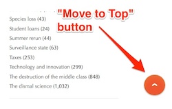
We now have a “Move to Top” button which, cleverly, does not appear when you actually are at the top, but fades in when you are farther down the page. Click the button, and you will be scrolled to the top of the page. This feature will also be useful on mobile, on which more to come.
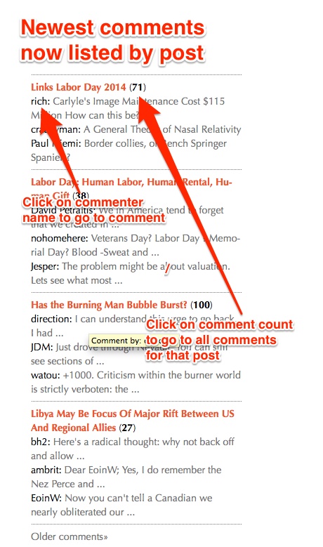
We have also changed the way that comments are listed in the sidebar. Now we list the most recently commented posts, with the most recent comments under each post. However, if you’re battling having discussion with another commenter, their name will still appear. We noticed that when a huge thread would break out on one post, those comments would drive everything else off the sidebar, and we wanted to make sure that quieter threads didn’t get drowned out.
And now to the experience of commenting, which we also hope is improved. You can can format your comment from a toolbar, spellcheck it, edit it after submission, or ask for it to be deleted (your own comments only, of course).
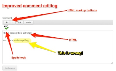
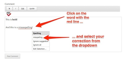
As you can see, we know have a comment editor with a formatting toolbar. If you want to make text bold, select it, click on the “b” button, and the HTML-ese for bold, the <strong> tag, will appear around your selected text. In addition, you can check your spelling by clicking the green checkmark.
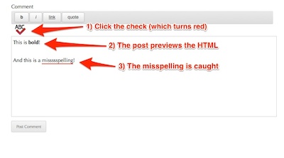
Here is the spellchecker in action: When you click the green checkmark, it turns red, at least if there is an error. It underlines the word that it thinks is misspelled in red — although, if you’re like me, you never spell words wrong, but do make typos or use words to fancy for the spellchecker to know — and gives you options for fixing it if you click on the underlined word.
If you click on the underlined word, you get a dropdown, where you can select the word the spellchecker thinks is right. You can also just type in the change yourself.
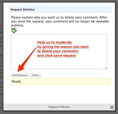
Even better, we have enabled a timer. You now have a window of time to edit your comments, and you can also request that your comment be deleted! No more subthreads with “I meant to type….” or “Yves, will you please delete….”!
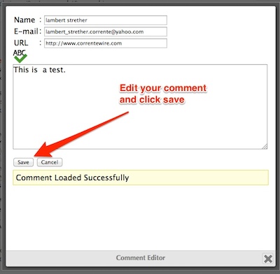
Here are the screens that come up when you edit or delete:
Please don’t write a novel here, mkay? Though we know you want to. Something like “I decided I don’t agree with what I just said” or “I’ve decided violating Rule #1 is a bad idea” or “On reflection, insulting the moderator was a bad idea, strategically” would be closer to what we have in mind.
And finally, here’s the screen that comes up when you edit your comment after submission. Make the changes, submit, and voila.
Naked Capitalism: Giving the best commenters the best tools!



Curses. Now fewer excuses. Must finally try to really learn html mark up skills.
(You all did mention fostering critical thinking skills as a NC mission unit. I am now thinking very critically about my crappy skils set.)
Super Wow!
Listen, if you don’t find any problems (or, thinking optimistically, anything to especially praise) I’m not gonna believe you actually used the new features ;-)
I’m really impressed with the edit feature. The delete too and the request to delete is a good idea. Of course I have to ask what happens to sub-comments when one asks to delete a comment to which sub comments are attached? Is that one of the reasons for the request?
It always looks so easy from the outside looking in. I imagine a lot of time went into planning, evaluating and making sure this worked as you wanted. These are great tools for NC commenters! (commentariat?)
A suggestion taken from another comment package (I think it was Echo) would be profiles where one could right click over a commenter name to see their last n posts/comments. This might be waaaay too impractical space and complexity wise and it’s not at all on the same level of usefulness as edit and delete.
Luxury!
You the Man Tony!
You the Man Tony!
Second that!
“Naked Capitalism: Giving the best commenters the best tools!”
how about the rest of us?
we are the tools that give them comments.
you mean fools?
ooohhh mannn
http://www.wired.com/2014/07/history-of-autocorrect/
You beat me to it. Be that as it may, this new time out thingy can be useful during outbreaks of foot in mouth disease. I do not despair. The Egyptians built the Pyramids to exacting tolerances using basic tool kits. We can do no less comrades!
congrats on the new format — all seems excellent.
congrats on the new format — all seems excellent.
hmm, DATABASE ERROR..
let’s click again:
COMMENT LOADED SUCCESSFULLY (this i write in “edit mode”) return doesnt work in edit mode. and i noticed that the comments are mucho mas slow in loading.
Foo Bar
and new lines.
Lambert, Yves,
Have a look at the funding website for propublica. They have a nice link to Donor Advised Funds.
Congrats!
Well done!
How to open a previous comment in edit mode?
???
Wow now I can see the edit button. It works!
You only have X amount of time to edit your comment; look at the counter.
I mean, imagine what would happen, human nature being what it is, if we left comments open for editing indefinitely.
mmm… no editing is best.
Spellcheck is ok, but at most enable a strikethrough -like a good fountain pen and journal. You risk airbrushing out spontaneity and extemporaneousness. IMO the uncorrected word salad versions can be more fun.
I really don’t like the “move to the top button”.
I pressed the button to see how it worked and just watching the page scroll
up for a couple of seconds gave me an epileptic fit. This is likely to be
an issue with others who also have epilepsy. In any case,
I am glad the button disappears when I turn off the Javascript.
Sorry for that. I suggest you check your Preferences in your browser. Firefox allows you to turn of the scroll. I don’t like scrolling in Firefox and I disabled it. It should snap to the top, not scroll.
Thanks Yves
I also use Firefox. The red button is still scrolling to the top, not snapping to the top.
It doesn’t bother me personally, but the button is not yet functioning as intended.
I really don’t like the “move to the top button”. I pressed the button to see how it worked and just watching the page scroll up for a couple of seconds gave me an epileptic fit. This is likely to be an issue with others who also have epilepsy. In any case, I am glad the button disappears when I turn off the Javascript.
I LOVE the new comments sidebar. It always struck me as a singularly useless feature before. Now it looks like it will actually add some value and be useful for finding active conversations. If you have also solved the problem of the same five comments being captured against every single article and preserved for all time based on the instant at which search engine robots decided to index the site (causing searches for keywords in those comments to return a massive list of NC content with absolutely no relevance to the search term) then I will truly be a happy camper. But that might be a bit too much to ask in the first release – plus I expect the number of weirdos like me who like to search for past comments is pretty small.
The edit changes seem good so far – did you also include logic to check for improperly-closed HTML tags, cross-site scripting and the like? I’d run a test myself but I’d prefer not to break the rest of the comments if it’s not included.
I wasn’t sure what the del tag was, so I looked it up and got a chuckle out of it. Kind of you to give us all the ability to write
backhanded insultsfaux deletions for ironic effect, just like Yves does.Thanks Yves !
Hi,
I am having some problems with the new commenting system.
I am running Slackware 6.0.
I do not use a browser. I pull down indexes from all my favorite sites using Curl. Then I have Perl scripts that pull down the posts I want. Then I have Perl scripts that let me read the posts in ‘less’. (I use ‘less’ because I think Lynx is bloated.) Then I have Perl scripts which analyze how I can comment on sites. Those scripts create functions – I pass those functions the content I want to post and the comment I want to reply to. Those functions, in turn, send the HTTP requests and (potentially) execute the JavaScript necessary to posting the comment I want where I want it.
All that, and I never have to open a browser!
However, that’s led to problems with your latest update. My script is broken now. Any ideas on the cause?
Love the new features! Great work, Yves and Lambert (and all elves in the back room).
Re orange button: my index finger thanks you for not having to use the scroll bar. (Windows 7, Opera browser features work well)
Well, I guess the squeaky wheel gets the grease, eh? This is going to save me so much time typing “a href=”… My employers thank you.
lol Lynx browser – I remember preferring that for a brief time in the late 90s because websites would come up faster, and without their graphical adverts
sweet