This is Naked Capitalism fundraising week. 826 donors have already invested in our efforts to shed light on the dark and seamy corners of finance. Please join us and participate via our Tip Jar, which shows how to give via credit card, debit card, PayPal, or check. Read about why we’re doing this fundraiser, what we’ve accomplished in the last year, and our current target.
By Lambert Strether of Corrente.
Bringing this mobile project to fruition is one of the reasons we asked for your help with tech funding (and why help with tech was the our first goal). So here are the first fruits of the project, in the form of screen shots (since the site is really pre-alpha, so far as interaction with real users is concerned). This being Naked Capitalism fundraising week, the tip jar is to your right.
Spoiler alert: We’re going to ask for testers at the end of the post; neither Yves nor I have smartphones!
Caveat: We’re not asking for design help; “This typeface is twee”, or “Could you change orange and grey to teal and pink?” are issues we can probably work out for ourselves, later, and are much lower on our list than user experience (“UX”); your experience.
We want UX feedback like: “This button doesn’t work for primates with normal sized thumbs,” or “When I press submit, the screen goes Wahooni-shaped,” or even “Company X handles the search box like this, and I think you should copy that approach.” Raising and resolving issues like these will be very helpful, both to us, and to all Naked Capitalism readers.
So, all that said, the screens that follow are proof of work, and proof that we listened to you when we got rid of the hated rather unloved OnSwipe, and worked to come up with a substitute. We’ve concentrated on the front page, comments, and begun to work on search. Full articles are yet to come, as is a mobile approach to material that lives on the sidebar for PCs and laptops. A big hat tip to our tech guy Tony for fighting his way through this on a tight deadline. Herewith:
1) The familiar Naked Capitalism logo and colors.
2) Recent posts appear when you tap on the recent posts button. (If you don’t like that extra tap, that’s a UX issue, and we want to hear about it.)
3) Here’s the antidote, which is really going to pop on a retina display (with one comment treatment).
4) Swiping through the front page, showing several article (with a second comment treatment).
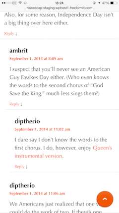
5) Comments nest. (Lambert: But how far?)
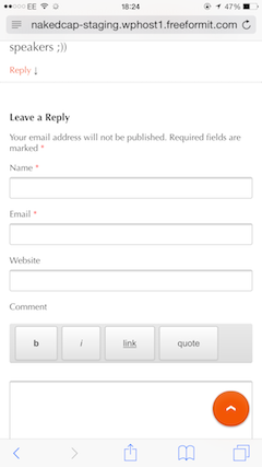
6) The comment entry screen, which adapts the improvements we rolled out for this fundraiser.
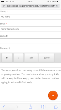
7) How the fields for commment entry will work: Tap to enter your name, and so forth.
I have to say, I’m an old-school blogger and I do a ton of reading, and Yves does way more; you can have no concept of how much material we process per day; we are like Baleen whales for data instead of krill. So the idea of reading material, especially long form material, on a tiny screen just seems incomprehensible. But I hang out a lot at the university union, and I see kidz these days reading text books on their cellphones all the time, and you can’t get more long form than a text book. So we must move with the times, and follow readers where they are going.
I said we’d ask for User Experience (UX) testing, so now I’m asking. We need a good range of current phones, and that’s it. (Resources being limited, we don’t want to be doing the mobile equivalent of supporting IE6, shudder, or Lynx on Ubuntu.) Our thought was to test for these platforms:
| Operating System | Manufacturer | Model |
| iOS 8 | Apple | iPhone 6 Plus |
| iPhone 6 | ||
| iPhone 5s/5c | ||
| Android | Samsung | Galaxy S5 |
| Android | Nokia | Lumia 635 |
| Android | Amazon | Fire Phone, 32GB |
| Android | LG | G3 |
| Android | HTC | One M8 |
Basically, these are Apple and Amazon top sellers. I think that “Android is Android” — that is, Tony won’t be in the insane position of coding for three browsers that all work differently, as in the broweser wars on the desktop — so I think that basically any Android phone is OK… And I deliberately did not add a screen size column, because it seemed like I was already asking for a lot; readers will correct me on both points.
Bottom line is that this table is more a set of suggestions than a checklist. We need to cover a good range of the current models of iOS and Android phones. (I suppose a case could be made for Windows and Blackberry; if so, please make it comments.)
So, readers, if you want to volunteer for Naked Capitalism’s Mobile Testing Unit, please say so in comments, and give the OS, brand, model name, and dimensions of the phone you’ll be using — Android or iOS. And check out the Caveat above: We’re looking for User Experience testers, not designers!
Thanks!
NOTE Pads and phablets are another project. The scope of this project is phones. The tip jar is to your right.


I know from experience – but rather related to video stuff – that Android on e.g. a Samsung S4 in Europe is not the same as on the US version of the same phone. Moving to other Samsung devices, or other manufacturers will add to the difference.
So you should not expect that Android is Android.
Older versions of Android ship with browsers that are not much more than wrappers around the system WebView widget, which tends to be a bit on the buggy/dated side. I think if you code to the quirks of a mid-2012 WebKit browser and test on Ice Cream Sandwich, you’ll serve just under 90% of the Android+Google devices out there.
KitKat and later use Google Chrome as their browser component, which is typically less quirky than the device browser as far as layout goes.
I would like to help test the mobile site: I have an HTC One with Android 4.1.2.
Thank you!
I have an ancient iPod Touch with a 1.4″ screen, and it gets a little smaller every day. I’m a (non-GUI) computer programmer. If you’re curious, here’s my blog:
http://aliteralmind.wordpress.com
I’d love to help out.
The Nokia Lumia 635 runs Microsoft Windows Phone 8.1, not Android. But it is a good idea to test on that platform.
Thank you! Can you help?
Cool. My iPhone is pre-5s, so I happily volunteer other people for this project. Hope it goes well.
“Kidz these days”
It is pretty awesome/terrifying how quickly PDAs became ubiquitous once they were able to merge with your cell phone. There are kids in elementary school now for whom touch screens are their natural interface. For textbooks I don’t care about, I would absolutely trade the smaller screen for not ever worrying about carrying the right books to the right building. Or remember when you would have to go to the campus copier store to get your packet of non-book reading materials? In fact, thinking about it, I haven’t bought an alarm clock, a watch, or a calculator since I got my first iPhone. It’s now my camera as well.
I don’t want an iPhone; who wants to be accessible, synchronously, all the time?!
So I have an iPad, which is useless for content creation; I’m not going to be writing a 4000 word post on it. However, I use it for all kinds of new purposes; it added on to my computing life, as opposed to replacing my laptop. I do a ton of reading on it, I photograph with it, I sketch with it. (Of course, I’m one of the people who loved the Newton — I bought both models! — so I would like the iPad.)
:-) To avoid being continuously accessible, just turn the thing off. I have a smartphone (not sure why as I think using the old flip phones have A LOT of advantages), but I turn it off whenever I don’t want to be tethered to the outside world. Peace and quiet is a rare and valuable thing these days. I have land lines for my family and good friends in an emergency, with voice mail. I refuse to allow any technology to control me, dammit.
The user experience is not only determined by the mobile platform by other many factors as well. Along with your mobile buildout it would not hurt to analyze your the site with Google Pagespeed Insights http://www.nakedcapitalism.com and the tools at http://tools.pingdom.com/fpt/ which can be instructive re. bottlenecks on nakedcapitalism.com that effect both desktop and mobile UX.
I work part-time at Field Agent. We have had an iPhone app for years, rolled out one for Android a little less than a year ago – with many problems. Most, but not all, have been resolved, and most seem to be trouble uploading, which will likely not affect you.
count me in
i’d prefer to respond in email
funny – i was just going to email youse guys about a mobile app
can’t believe you & Yves don’t have “smart” phones considering what rock stars you are!
Thanks! We will look for the mail.
When I leave my desk, I want to leave the Internet. Being jacked in all the time is bad for your psyche. And I spend ginormous amounts of time at my computer.
Plus I don’t like the NSA surveillance possibilities of a smartphone. Yes, they can geolocate you with a stupid phone, but my stupid phone is not quite as tightly tied in to the rest of my personal identity (not that they can’t find it but it would take one step more work).
I have an I Phone 6. Let me kmow how to get the APP
I would like to test. I have Samsung G3 Android 4.3
Happy to be a tester.. iPhone 5s iOS 7.1.2
I use my phone almost exclusively when on the internet. I can test a iPhone 5, with iOS 7.1.2. Will not move to iOS 8 anytime soon as it uses too much space.
iOS 7.1.2 was the last 7.
I have a Nexus 5 with a 5 inch screen running Android 4.4.4. I would be happy to test out your new mobile website.
Jonathan
Hello, would be happy to be a tester. I regularly read Naked Capitalism on my phone. My phone isn’t one of the ones listed though; it’s a Motorola Moto X, 2013 model. Android 4.4.4. Let me know if that’s any use.
If you’re curious about how the site works with a small, cheap Android phone, let me know.
I have an iphone 5c running ios 7.1.2. I’d be happy to test if you want.
If it is not too old to be of use, I have a Galaxy S3, android version 4.4.2. If that is too old, I may be able to use my husband’s Galaxy 4, if that would work for you.
I’m a UK resident using a Galaxy S4 (see JL Furtif’s comment above European vs US phones) with Android 4.4.2 and a screen size of approx 4.5″x2.5″. I’d be happy to check out the mobile app.
I’d be glad to be a tester. I have an iPhone 5s with the updated iOs 8