Yves here. As much as the terrible Administration response to coronavirus can’t be criticized too often, it is still the sad case that public health is a state and local responsibility in the US. Nevertheless, consistent messaging and funding testing and other programs could have made a huge difference, particularly early on. I second NewDealdemocrat’s recommendation to check out endcoronavirus.org and see how your state is faring.
By NewDealdemocrat. Originally published at Angry Bear
Since the federal government has abandoned the field, fighting the coronavirus pandemic has been left to the States, territories, and the District of Columbia. This means that there is no unified response and instead there are 52+ individual responses. That is the biggest challenge in tracking the pandemic.
Which means I’ve been looking for the best resources to show how the States are doing in comparison with one another. I’ve found a couple of good ones, so here are snapshots below.
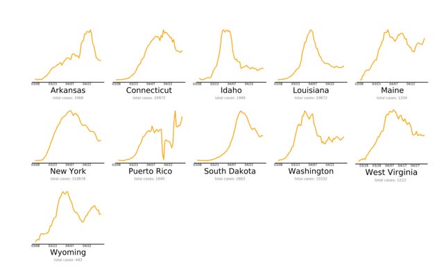
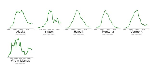
The first is endcoronavirus.org . They have thumbnail graphs of the 50 States, DC, Puerto Rico, Guam, and the Virgin Islands, divided by the trend in their daily new cases. The list needs to be updated from May 5, as shown in the below sample of “States and Territories that are Nearly There”


Aside from needing to be updated (PR and ME clearly aren’t “nearly there” anymore), the graphs are not to scale, so for example a decline to 1000 to 500 cases daily shows the same as a decline from 20 to 10 cases daily.
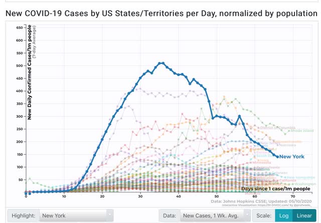
The problem of scale is addressed by 91-divoc.com . For example, I have been examining in a lot of detail the relative success of NY vs. other States in attempting to “crush the curve.” Below is a graph from this site showing the 7 day average of new cases in New York State (highlighted in blue) per capita, compared with all other States (faded lines):

This shows that, although new cases in NY have declined by over 70% from peak, on a per capita basis NY is still among the top 10 jurisdictions. In other words, despite its success, NY still has a long way to go to actually “beat” the coronavirus.
The two shortcomings of this site are that it does not have a screen for comparing testing, and that it does not allow highlighting two or more jurisdictions and eliminating the rest, so graphs are too junked up.
Another big issue is how well, or poorly, various States are ramping up testing. In particular, as I wrote yesterday, NJ is doing very poorly in testing and is undoubtedly missing many new cases of coronavirus. Hence the idea that the NYC metro as a whole is beating coronavirus compared to other States is fatally flawed.
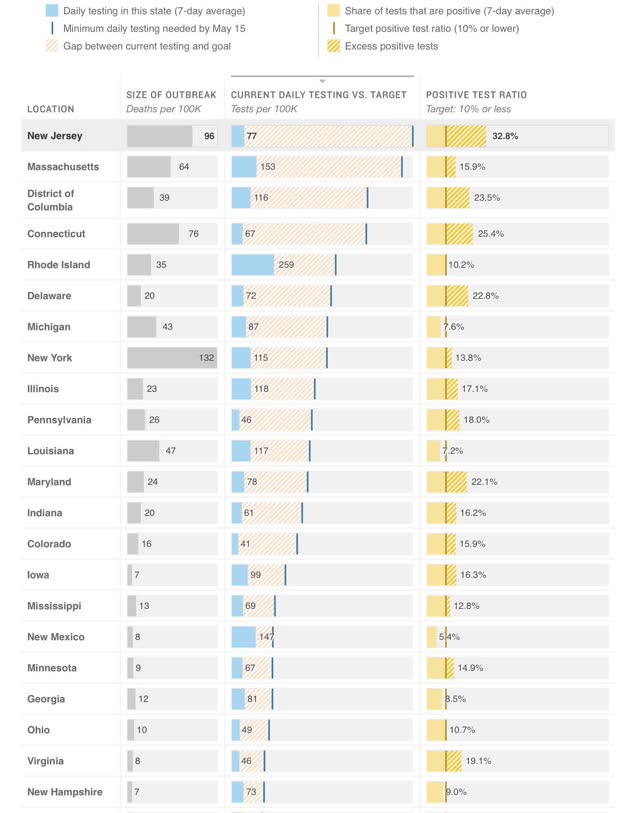
The best site to show this is via NPR, which compares the amount of testing done by all 50 States plus DC with the amount of testing they *should* be doing to catch all of their cases according to several models. The jurisdictions are listed in order of the number of tests they should be performing. Below are two graphs showing all of the jurisdictions aside from Montana, Alaska, and Hawaii, which have minuscule cases and plenty of testing:

The absolute worst by far is NJ, which is probably missing over 30% of its new cases. In numerical order CT, DC, NE, DE, and MD are missing over 20%. Also in numerical order PA, IL, KY, IA, ID, IN, CO, KS, SD, MA, MN, NY, MS, RI, AZ, and WI are all missing over 10% of theirs. That’s 20 States plus DC in total, including almost all of the Northeast corridor plus much of the Midwest and a smattering of others.
Although both NJ and CT have seen a sharp decline in the number of new cases (because they are also missing a huge % of new cases at peak as well), the idea that the NYC metro outside of the State of NY is doing a good job is simply not justified.
Going forward I anticipate relying much more on these sources. I will be looking for States that show:
(1) at least a 50% decline in new cases averaged over 7 days
(2) to less than 50 cases per day,
(3) normed by the percentage of missed tests,
(4) which missed tests are less than 10%.
At the moment, outside of a few sparsely populated and island jurisdictions, they don’t exist.


thanks for this
Because so many can’t ‘see’ any threat–and because Humans are so visually oriented–I believe visuals-for me- have more impact on perceiving the threat.
Certainly more ‘Red’ graphs than any other color and certainly brings new meaning to living in a red state.
I think Texas’ results are partly due to geography. A large chunk of the state is sparsely populated; most people live in the small or large cities. So the state resembles both California and Alaska at the same time. The extremely low testing rate hasn’t hurt the state so far. Or maybe there’s many more cases than we know.
Mask-wearing is only a suggestion, per the Gov. Because rights, and business.
Where is Oregon in these graphs and lists? I believe our state is doing pretty well and am surprised to see no mention of it.
Also, when the international graphs are shown, where are Cuba, Venezuela and Nicaragua? All three countries, despite or perhaps thanks to their US imposed isolation, seem to be showing the best figures in the Americas, and it’s odd that they don’t feature in the graphs.
Where is Oregon? Go to the NPR link. All states are there, and Oregon is doing VERY WELL compared to most, so I can see where the rural counties can successfully open up if done right. That means no idiot tourists from Portland Metro going to rural counties just to relieve boredom. I’ll take the under on PDX people being smart about this.
Expanding on this a bit, with my own opinion and inherent bias, rural counties are really hurting across the country. I think that these counties, where the circumstances warrant it, should be given the ability to define what they do to enable their own communities to survive.
What I would like to see is local control with the understanding that it is on you at the county level to manage virus spread. If that means they decide to implement road blocks to self isolate whole communities, then they should be able to do that. Protect your own communities but let them function internally as much as possible. Counties with less than 5 total cases and no deaths should not be in lockdown.
Again, they could open up by telling others “Leave us alone” – via highway checkpoints if needed. This probably won’t work everywhere initially, but people need to act like responsible citizens of their own local communities and work together for mutual benefit. Rural people don’t like Big Brother dictating to them, so putting control into their own hands should be better on several levels.
Once the virus fight becomes helping your next door neighbor the political dynamics change. Lots unsaid here but I doubt many here miss the point.
One item I find a tad surprising that’s missing from the article is any mention of the covid-19 fire raging in the plains states. S. Dakota, Minnesota, Nebraska, Iowa and Kansas (adjusted for population) are still getting worse or have only just recently bent the curve. Add in on top of that re-opening plans and it’s hard to see how these fires don’t get worse.
I follow MN closely due to family connections. There are serious problems in these states due to the working conditions in meat packaging plants. This has been well covered at NC. Look at county specific data and make the connection to the poor working conditions in those towns. Rural counties with no such facilities have very few cases, sometimes zero and often less than 5. In counties where there are no facilities where people are forced to work close together, plus have near zero cases, I believe that closing rural communities is like locking people up with no due process. Rural communities could self-isolate from the rest of the world and function to some extent. That’s just how I see this.
Counties with meat packing plants are not truly rural, so they need extra care with all the requirements as for cities: adequate testing and all that
Great insights, I suspected as much by the news coverage, all be it limited.
I see you’ve grouped them as rural but in fact one of the other things that states like Alaska Montana, and Vermont have going for them is that they have low frequency of travel, particularly in the winter/spring, and they moved quickly enough on lockdowns and travel restrictions. Alaska and Hawaii, for example maintain a 2 week quarantine for all visitors even residents returning from other places. In effect they are emulating what worked in other countries and what could have worked nationally had we acted quickly.
These graphs show the disaster of a 50 state public health approach to a global pandemic. What did green Vermont do right and red New Hampshire do wrong? Both states declared an emergency the same day. On the endcoronavirus.org site I disagree that Maine and Puerto Rico are nearly there. Oregon is in Red. This shows the looming disaster with states reopening and no national public health system implemented that tests everyone, traces and tracks all infections, and isolates the infected patients in secure safe quarantine facilities.
The USA is absolutely failing to control the pandemic. A million or more Americans will die with the states reopening unless the plutocracy is ended and democracy restored and a functional public health system reconstituted.
The world has turned bi-polar. There are 30 countries not controlling the virus; all of North America and in Europe; Belarus, Bulgaria, Finland, Romania, Russia, United Kingdom and Sweden. 32 countries are controlling the virus. These are mostly in Asia, the Baltics, some Eastern European and island nations. To stay green the virus free states must maintain strong borders and like Austria test newcomers to prove they are virus free or force them into quarantine.
Globalism is dead. Until the pandemic is over, even goods and money from the contaminated area will be suspect. The prudent would have no contact at all with infected nations.
Sadly I keep telling people not enough of the right people have died yet. Eventually covid-19 will do it or the angry mob that follows.
Thank you for the link to https://www.endcoronavirus.org
A fabulously useful data presentation.