By Lambert Strether of Corrente.
The original post morphed into a series: Part One; Part Three. –lambert
Readers enjoyed my previous semi-autobiographical post on “writing tools” (reference works like the OED) so I thought I would stumble my elided way further on down the road to creating what today we call content (but was, back in the day, lacking a unifying abstraction,called, depending on where “it” was in the production process, writing, or copy, or type, or galleys, or pages, or newspapers, etc.). Of course, my focus is old-fashioned, and textual; today, “creators” — vile term; the creator/creation is always platform dependent — make content in many media, including not only text, but images and video. (I don’t know why musicians aren’t called creators, but so it goes.) Anyhow, the art and crafts of making words into type will doubtless endure, in some form, no matter what is to come, when data center-dependent media stutter and wither in the heat:
Tempted to buy an old letterpress machine to start making a monthly snail-mail newsletter. Entirely offline. Payment by mailed check/ gift card, or local cash/ barter only.
Making a living as a writer online has been a blessing, but the whole "cashless economy" thing scares me.… pic.twitter.com/NbzhRo63To
— 𝙷𝚒𝚌𝚔𝚖𝚊𝚗 (@shagbark_hick) September 17, 2024
But this post is about the transition from analog to digital type, and digital is what content will be, for the forseeable future [snort]. After I rolled down College Hill and ended up in the mills, I retained some of my academic connections, even though they had gone on to grad school in Boston, and we corresponded; I read their theses, and so forth. I started out by writing letters in long-hand, but that was laborious, and somehow (I don’t remember how) I acquired an IBM Selectric Composer (not the mere Selectric but the Composer):
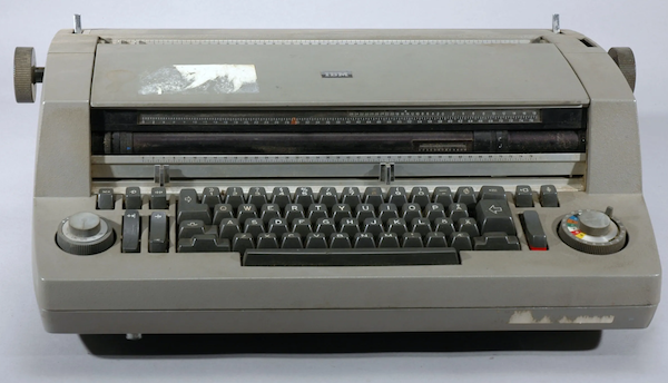
The Composer was metal and weighed a ton. From IBM’s “The IBM Selectric,” the machine struck the paper with
a spherical element [“ball”] measuring 1⅜ inch in diameter. When a typist pressed a key, the sphere would instantly tilt, rotate and progress across the page to ensure that the proper character would be imprinted in the appropriate spot, eliminating the need for a moving carriage. To minimize the rotation of the type element, lowercase letters were arranged on the front and uppercase letters on the back. The type element was made of molded plastic and blasted with walnut shells — sand would have been too abrasive — to remove burrs. The last step was chrome-plating, for durability. The type element didn’t strike with as much force as type bars, so IBM’s type designers lengthened some serifs and shortened others to make the impressions more equal.
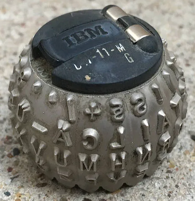
(The process of altering the shape of type to optimize for the composition technology has a very long history, all the way up to the digital era. Also, I love the walnut shells. IBM put an engineer on that, and they figured it out!) Here’s the ball:
This was good type, for its day, and didn’t require hot lead, either. By printing on paper, the Composer enabled the type to be photographed in a large camera, and that image to be transferred to a printing press plate (“phototypesetting”), which you will note is not yet digital:
This highly-modified (and much more-expensive) Selectric produced camera-ready justified copy using proportional fonts in a variety of font styles ranging from eight points to fourteen points.
There were several fonts, and you changed the font by changing the ball. As a bonus, the characters were “proportional”; they could have different widths (unlike a monospace font, like Courier, where “.” is the same width as “M,” which isn’t especially readable (and centuries of craft have gone into making type readable)). This made the Composer suitable for professional work that needed to look better than typewritten but wasn’t worth spending genuine typesetting money on.
Historical sidebar: The “Killian Documents” controversy that took down Dan Rather turned on whether Killian’s military base had a Selectric that supported proportional fonts, or not; the documents, which used proportional fonts, would have been created on it. Readers may correct my memory, which bit rot forces me to rely on, but my recollection is that Killian’s base had my model of Selectric, making Rather right and his detractors wrong, although nobody but obscure bloggers raised that issue at the time. But it’s been years. End sidebar.
This Selectric branch on my golden path petered out, not that I thought I was even on a path at that point, being young and stupid. (Had I leveraged my typesetting knowledge and gotten hired on at the right shop, I’d probably be a Vice President now; just imagine!) I ended up in Boston, and after working in a brake shoe factory for a stretch, I ended at at a weekly “alternative” newspaper — they had such things then, alternatives, I mean, not newspapers — where I started out as a janitor, and then ended up being a sort of coordinator/expeditor for advertising production. (Oddly, there was nobody on the production side with that job, so I worked for the Sales Department.)
The production department had two branches. There was a Typesetting Department that had a row of terminals with keyboards where typesetters sat; they set their copy at the keyboards, and the terminals spat out yellow punch tape, Jacquard-loom style. The punchtapes were then hung on big blue phototypesetting machines, one punchtape per job, and the Master of the Phototypesetter ran the jobs in the order they felt best.
Fonts for the phototypesetting machines were stored not on balls but disks; the disk was opaque; the characters were clear. The punchtape positioned the disk, character by character, and then fired a light through the transparent image of the character onto photosensitive paper, fogging it in the character’s shape (so you see we are still very much in the analog world). When the tape was done, the phototypesetting machines developed and printed the paper, just as if it were a miniature darkroom, and the department smelt of vinegar, like a darkroom. The paper, when spooled out of the machine, was called a galley.
You can see that the Master of the Phototypesetter would rather change the disks as little as possible, and would much prefer long runs of story after story set in the font that content of the newspaper used, rather than running a bunch of dinky little jobs for the ads, all in different fonts, and different sizes. So I had a certain amount of negotiation to do, to keep the other department — the Art Room, that made the ads the Sales Department sold — working smoothly, by coaxing the dinky little jobs from the Master when they were needed. (For example, a client might need to proof an ad, and the only piece missing was on that little yellow punch-tape right there, so could you please run it? “I’ll make it up to you on the back stretch,” as I heard a salesman say once).
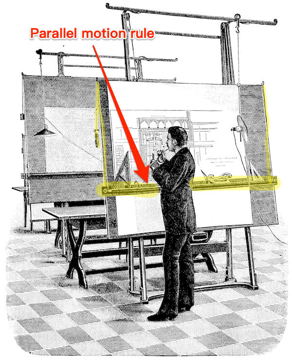
The Art Room had two rows of slanted drafting tables, each with a lamp and a parallel motion rule. Here is an image of a Nineteenth Century drafting table with a parallel motion rule; the implementation is the same today:
Along the top of each table were arrayed — if you love going to stationery stores you will love this — the artists’ border tapes, Rapidograph pens, rubber cement solvent, non-repro-blue pencils, burnisher, pica rulers (metal; transparent), T-Squares, triangles, orange-handled Fiskars scissors, and other cutting implements (X-Acto knives or, my preference, single-edged razor blades). The sound of the typesetting department was the clickety-clack of the keyboards; the sound of the art department the whirr and slap of parallel motion rules being positioned. And music. Like this:
Or this:
The smell of the Art Room was hot wax and metal. Each advertisement was created on a non-repro-blue gridded sheet of smooth cardboard (a “board”). The artist began to create an ad by running a galley through the waxer, which applied hot liquid wax to the back of the galley. Then they cut the type out from the galley and arranged it in a manner pleasing to the eye and the client, along with photographs, also waxed (“half-tones,” a whole other branch of production I’m skipping); the wax was tacky, so the type and the photographs stayed put, but could be repositioned. When the appropriate border tapes, Rapidograph inking, and whiting-out was done, the entire board was burnished with the burnisher (a wooden or rubber roller), wax wiped off with rubber cement solvent, and the board sent off to the Page Makeup Department (which was editorial’s domain, so I could only go through it). Editorial then waxed backs of the ad boards, and burnished them onto the big boards that held the actual pages (galleys, also burnished, plus ruling done with border taoe, and images, standing elements, etc. (When the pages were approved, they were driven to the printer, who, again photographically, turned them into plates for their offset press. Sometimes I was lucky enough to go to the printer’s!)
The key points of manual paste-up technology: All the elements were held firmly in place by wax, and the geometry was enforced by the parallel motion rule, T-Squares, and triangles. The same was true for the Page Makeup Department. So you can see everything is still firmly analog.
Analytical sidebar: Pages were arranged in the Page Makeup Department in order on long slanted tables. One evening, as I was walking past, I saw that one page’s board had all the ads pasted in place, but an overhang of about two feet of galley. Clearly, some writer had exceeded their word count! Would the ads be moved or removed to make space for the words? Or would the writer cut words, and the Typesetting Department rerun the galley? What do you think… So that incident was helped me understand the news business; I was not quite so young, and perhaps not quite so stupid. End sidebar.
This whole process was called “pasteup” (today, “manual pasteup”) although I suppose it would have been more logical to call it “waxup”; perhaps there’s history I don’t understand. Pasteup was a very useful skill to have for at least a decade or so; in fact, the happiest, most pressure-free job I ever had — at least in those days — was doing pasteup. However, the alternative newspaper business being overly dynamic, my next job was as a typesetter, using the generation of phototypesetters that followed punch-tape. Here, then, is my first computer: The AM Varityper (from a 1980 brochure):
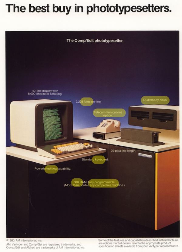
Here, in 1980, you see the most of the elements of an early modern desktop computer: RAM, keyboard, disk storage, modem, monitor (I’m sure you can spot the missing element). I wasn’t a very good typesetter, in fact, if volume and speed were the criteria, I should have been fired. However, the firm did a good deal of mathematical typesetting, and I managed to work out how to program the AM Varityper so as to move the “print head,” as it were, to format and position the fiddly bits of (relatively simple) equations. So that was pretty neat!
The essential point, however, is the transition: By programming the machine this way, I had moved geometry — albeit at the paragraph level — out of the analog realm into the digital: No longer were little bits of type being waxed, positioned, and burnished down; my programming did that; everything came out on the galley in place.
The same transition is visible at the page level in this brochure for the AM Varityper’s final model (“final” because the firm had business difficulties and liquidated). Here it is:
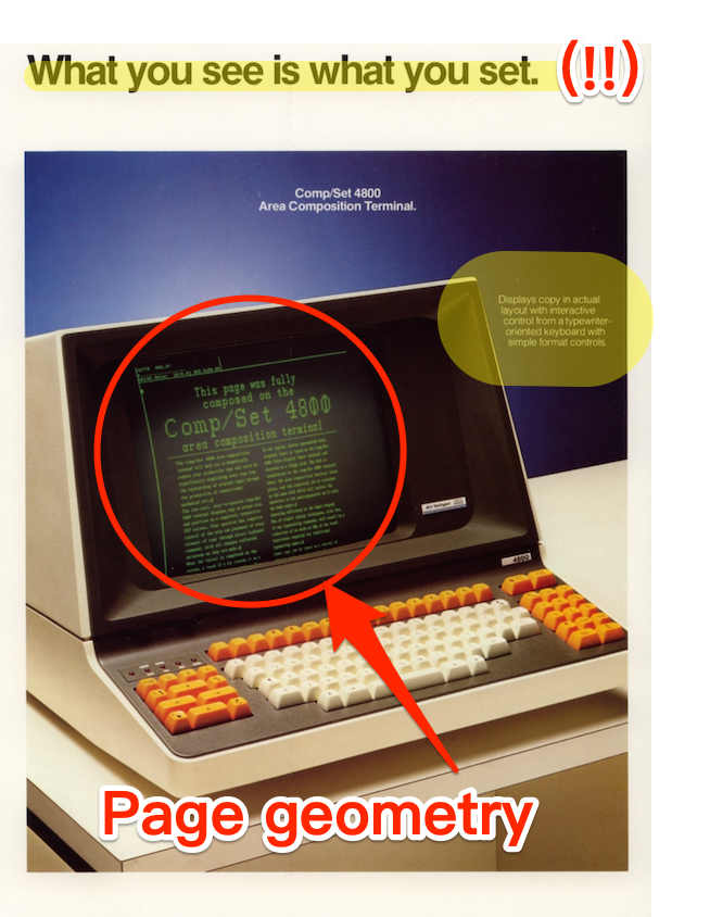
Notice first that now page geometry has been moved from the analog to the digital realm; not the entire page, it is true, but at least the columns of type. Notice also the slogan: “What You See Is What You Set.” The catchphrase apparently originated on the Flip Wilson show, but is it too implausible to consider that Apple’s marketing department, when they ignited (I don’t say “invented”) desktop publishing in 1985 with the introduction of the LaserWriter, had this brochure in mind, given that it applied directly to their target market?
Oh, and we have just seen how we removed page geometry from the analog realm to the digital; but the LaserWriter made the production of type itself digital, as well. (“Laser printers read the electronic data from your computer and beam this information onto a drum inside the printer, which builds up a pattern of static electricity. This attracts a dry powder called toner onto the paper which is then fused using heated rollers”) No more balls or disks!
As you can see, I really loved the now-vanished world of phototypesetting and manual paste-up; I wish there were a novel about it (though I’m not writing it). I did, however, welcome desktop publishing, because I felt that the essential elements — design, page geometry, choice of typeface — were achieved more cleanly — no more continuous breating of rubber cement solvent! — and productively on the computer.
These two posts, were, as I wrote, intended to be a single post, and that post was also to include how the Macintosh empowered me as a writer, so I wasn’t only a production guy (and though I say it, a good one). Perhaps the next post, if readers aren’t bored?


I remember those days well, as a young teenager. Hung around a tiny publishing company. I typed body copy on a Selectric Composer, and occasionally made justified text which required typing every line twice so it could calculate the variable word spacing required. We did headline text on a Mergenthaler V-I-P phototypesetter. That was an awesome machine, with 6 fonts at a time. Fonts were little rectangles of film back then, costing several hundred dollars a piece. I was not allowed to change these, lest I get a finger print on one, or worse tear the film while mounting. Processing the exposed film from the Merganthaler was a chore until we got an automated film processor, another amazing machine. One cannot forget the smell of the wax machine. And the room-sized process camera. Blue lines. I still have my trusty pica pole. A lot more care went into content back then. No need now, your bits will expire before you know it, so why put in a lot of effort? Except for the love of creation, that is.
> Except for the love of creation
Exactly.
After graduating with a Fine Arts degree, I worked in a community college relations department and we designed, wrote copy, and did photography and paste-up for college brochures. To set type we used a new-fangled typewriter that was a fancier version of the IBM Selectric. Wish I could have gotten better at paste-up as nobody taught me how to do it, but I muddled through. My friend steered me to a graphic arts program in college and that was the only info I had about the old ways of production and primarily, offset printing. It was fun to use the old Pentax K-X, too. Our state land grant school opened up a new design building and I returned to study interiors where we used T-squares, triangles and x-acto knives.
Fascinating memoir, thanks for putting it all down. I remember skilled people doing paste-up and offset printing on student and in-house publications. Relatives got to work on the last Brittanicas and Sears catalogs done with hot lead linotype. We all love the internet, but the deliberate craftsmanship and accuracy of all the old procedures is not well lost.
Good stuff Lambert, thank you, I enjoyed this.
I have kind of a parallel experience. To explain a little, while trying to be brief as possible; I’ve been retired for several years, so I’ve been around since the days before computers and we did things a different way. I worked as a draftsman starting sometime in the early 80s. Our tools were a drawing board, T-square, ruler, compass, and a mechanical arm.
We used various type pencils for the paper stuff, then later went to what was known as mylar, and used plastic lead in our pencils. We would create drawings, then feed them through a printing machine to make copies, which allowed the originals to be stored. You might have to change them later. Mylar was good because too much erasing ripped holes in the paper, and we were armed with a rotary electric eraser. :-)
I don’t remember exactly when, but once computers hit the scene, CAD (computer aided design) was born. We began with slide rules, then calculators, but once the power of the processor came along, the entire world changed. AutoCad (made by Autodesk) hit the Windows world in 1992. Before Windows, CAD systems were running on Unix or something similar (read higher cost – I started on a Sun Microsystem Sparc station running Unix). Once it hit Windows it hit the world.
All the nice things we have today is because of the incredible advances in this technology. Today, everything (with exceptions of course) is 3D modeled on the computer. This allows them to design, assemble, simulate, and test designs and products before they ever hit the market. Truly incredible technology. I was lucky enough to witness this from the days of pencil and paper to what we have today.
Next week: Lambert’s history with lorem ipsum, so far.
I’ll take that as a request :-)
Seriously, lorum ipsum is bad. If you really want to test your site, do it with real content, so you read (as opposed to glancing at it).
FWIW, that is exactly my memory of the Killian files that sank Dan Rather, pushing him off into Podcast Land. In any case, Richard Nixon is proof that Shrub did not report for Texas Air National Guard duty in Alabama. How’s that, you ask? Well at the time there was a story somewhere in the media from the son of a Naval officer who served in the South Pacific during WWII. The father’s story went something like this, recounting conversations with his shipmates: “Remember that skinny lieutenant from California who always took our money playing poker? Did you EVER think he would be President one day?” No one in Alabama could be found who remembered a goofball George W. Bush passing his TANG time in Alabama. No. One.
Regarding the Selectric, what a machine! I went from a Smith-Corona with the cartridge to a Selectric in my first lab job and it was like landing in Never Never Land. And later Mrs. KLG worked as a paste-up person for a friend for a few months after we were married. He published a local advertising supplement that was quite popular and lucrative. I miss an analog world. The skills I developed as the lab illustrator served me well, though. Vellum, French curves, Rapidograph pens, LeRoy Lettering Sets. You were either deliberate and very careful. Or you went insane and the figures in your papers were ugly. An excellent complement to dealing with the data up close and personal.
Recently, I threw out my dried up Rapidograph pens but I still have my French curves — ooh la la;)
Regarding the digital revolution in typesetting, there is a slightly poignant snippet in Tracy Kidder’s wonderful book “The Soul of a New Machine” concerning Steve Wallach, the architect of that machine:
“Wallach was raised in Brooklyn. His father was a compositor, a practitioner of the craft of hot-metal typesetting, which will soon be all but demolished by the craft that Wallach chose to pursue. There is irony in that, but Wallach didn’t think it lamentable. He remembered his father coming home from work with his clothes and hands covered in indelible printer’s ink, and his father saying that he did not want his son growing up to come home dirty too.”
Nobody ever mentions it these days, but the Selectric had an absolutely unsurpassed keyboard feel. No keyboard since has even come close, although the original PC/AT keyboard was almost a contender.
If you want a good keyboard now, go to the separate section of the store for “gamer” keyboards. They are far superior to the office keyboards.
I did many of the same things as Lambert, but a little later because I was working in small towns that acquired the technology later and let go of it later. I was still doing wax paste up in 1994 at a weekly newspaper in Ohio. I can’t improve on Lambert’s description though.
I had always thought it strange that the regular writers here at NC and the commentariat seldom opine on the very literal thing that we all have in common: using a keyboard to type (write) a comment or post.
There is a probably apocryphal tale of Ernest Hemingway asking Ansel Adams what type of camera he uses. Adams retorts, “Hemingway, what kind of typewriter do you use to write your novels?” The implication is, of course, Adams is such a skilled photographer that he can shoot great photos with any camera. But that’s the kind of stuff I am curious about. What kind of keyboards do Lambert and Yves use? I sure hope it is not the integrated keyboard on laptops because those are all ergonomic nightmares. More on ergonomics in a moment.
I am not old enough to remember the Selectron typewriter, but I do know a little about keyboard history. (See this article interviewing Marcin Wichary, who wrote an entire book with numerous photographs of antique keyboards.) The IBM Selectron and the Model M keyboards were monumental feats of engineering. There are still Model M lovers now who cling to their keyboards, miraculously converting an old AT connector to USB, which is necessitated by modern computers. The defining characteristic of the Model M is the buckling spring switches. I own—but stopped using—the contemporary Unicomp keyboard, which has the unique buckling spring and its satisfying clickiness.
I typed this comment on a columnar staggered split Corne keyboard. This keyboard has helped me realize all the bad habits I developed from decades of typing on a traditional keyboard in all its Procrustean inflexibility. For example, I previously would make a typing error and upon immediately recognizing this, I would smash my right pinky into the backspace key. I suppose one reason why I used so much force was because I was consciously aware that I made a mistake. But what was the point? The computer doesn’t know or care how hard I pressed a key. With the new keyboard and the incredibly customizable QMK firmware, I can place the backspace key within easy reach. In my case, I press a right thumb button for space and a left thumb button for backspace. My left thumb is a whole lot stronger than my right pinky, and if I make an error I nonchalantly hit the backspace, barely even moving my hands.
Another example of my typing habits causing me pain is related to how I use a web browser. When I browse, two very common keys I press are Page Up and Page Down. In firefox and its derivatives, PgUp and PgDn scroll up and down, of course, but Control+PgDn and Control+PgUp change to the next tab and previous tab, respectively. That means I spent a lot of time physically moving my right hand from the home keys (J, K, L, ;) to PgUp and PgDn. I have likely done that motion a million times. I only recently realized that I can remap keys to wherever is convenient. On the new keyboard, I can temporarily turn J and K into PgUp and PgDn. That’s a whole lot better and less painful. Why should I rapidly press PgUp and PgDn with my right index finger and place undue stress on my finger, when I can have PgUp and PgDn mapped horizontally so that I use the index and middle finger?
Nevertheless, the new keyboard has been a pain free revelation. I should note that I can sense tiny amounts of pain that normal people do not feel.
Maybe you should consider a Dvorak keyboard. The keyboards that we use now – the Qwerty layout – was designed to slow typists down although this has been denied. If you type too fast, the key hammers jam together before they can fall back and this happened to me a few times with a manual typewriter. And the qwerty layout was made for salesman to sell the typewriters. If you look at your keyboard right now, you will notice that all the letters to type out the word ‘typewriter’ are all on the same line. It was done so that salesmen could quickly type that in front of prospective customers to impress them. The Dvorak keyboard was designed so that the letters most used would be right under your fingers-
https://en.wikipedia.org/wiki/Dvorak_keyboard_layout
But after using Qwerty for over a century and a half, it is dug in and you are more likely to get the US to switch to the metric system than to get rid of the Qwerty layout.
Adjacent hammers jam together (because they get into each other’s lane for most of their length), and letters that are often typed one after another should have hammers apart.
At one point I purchased a “buckling spring” keyboard, though I don’t remember the brand. It did have a great feel.
However, for most of my computing life, I’ve used whatever keyboard came with the model of Macintosh I owned at the time (including the Nimitz, as I believe it was called). And now, because I work on a laptop, lugging a big keyboard around is not an option.
I can’t say the Mac keyboards are great. But I think the real test is whether I got carpal, and I never did.
I typed and mimeographed – on a Gestetner machine – a dorm newsletter in 1966. A few years later while still at college I had an office job where I had a Selectric – the plain one, not the Composer – it was very neat. In addition to being able to change fonts or go to italic by changing the type ball, you could also get “bold” with the same type ball – it typed over the text with a very small lateral shift. Need to erase? Just hold down a button, and the ball goes backward typing with the whiteout ribbon. It was a quantum leap in the world of electric typewriters. As I think back on it, the improvement was sort of like when I got my new car last year with various modern safety features – a car with radar – truly, as the Firesign Theatre said, This is the future.
I remember looking back at how offhand I felt at the big change to terminals.
Maybe it was because in the early 1970’s I had a job typing copies of the old Salem deed registry books, which made me a cross eyed witch, trying to read the 18th century entries, whose script included “f”‘s for the letter “s”, etc. Later I heard they couldn’t find anyone to keep trying to read the old registries, threw away what I’d done, and took advantage of that new-fangled microfiche.
The perspective I gained may have helped me nonchalant enough to survive having to learn yet another software language, editor, etc., for decades after.
Absolutely guaranteed that years after those microfiches were made for those old Salem deed registry books, that somebody had to sit down with them or the original books and type them up again so that they could be entered into a computer database for online use. If those fools had kept your typed transcriptions they would have saved themselves a lot of work. Transcribing old handwritten papers is not fun at all. Been there, done that and gotten the t-shirt.
I learned to type on what must have been one of those IBM ball typewriters, but we called it a golf ball typewriter. It also had a built in typex key, which in my case was very useful.
I didn’t learn to type on one of those. I have always been one of those 2-4 fingers typewriter and used the typex key with generosity. Before that “Scalectrix” (that’s how i called it) we had also have an Olivetti machine. These were very useful machines which i hated wholeheartedly. I used them only to type advance reports for grants and other official documents. That explains why I hated them.
Then i still remember when we made Scientific posters by pasting printed sheets in a cardboard. Only to make the title in big enough letters was a task!
I learned to type on an IBM Selectric in a room filled with kids in high school. Can still type at the max speed I learned, 40wpm. I remember a kid who could do 120. I later worked at Big Blue in the OS/2 era and grabbed an old red Selectric from the storage room to put on my conference table as a conversation piece. I still have a ball and also some other souvenirs of the era, including a giant Selectric ball pencil holder. Selectrics in good working order go for around $200 and up.
I also learned paste up from my graphic artist roommate a very long time ago, and it’s served me well as a skill that transfers to other things, like just being able to put together elements on a 2d surface in a proper composition.
> Can still type at the max speed I learned, 40wpm. I remember a kid who could do 120.
I am a fast-ish but inaccurate typist. I never learned to touch type, though sometimes when I get in a zone I temporarily believe I can.
Lambert Strether: We are roughly the same age. I can tell by your Hot Type Years.
After years and years as an editor and writer, I often mention now that the reason work in publishing is satisfying and tethered to reality is that we learned to deal with physical limits. Paper folds into signatures of 32, 16, and 8 (in a book a signature of 4 is impractical). The boards were waxed. The typeset copy is / was a physical object. The drawers of fonts of type in lead are magical to open.
And books have a certain scent. Editors know what I mean, the sheer joy of handling and smelling paper.
To protect the boards, graphic artists also covered each with tissue paper, usually held in place by a couple of pieces of tape up top. The whole physical process was intriguing — as well as a joy in itself.
Tomorrow, I will collect my ARCI card at the Archivio Tipografico here in the Chocolate City. I run my yearly ARCI membership through them. (ARCI Is the enormous association of cultural, entertainment, and other associations set up years ago by Those Darn Commies — SlowFood started as ArciGola.)
As an editor and writer, it’s the least I can do. And the big rooms lined with flat files filled with lead type, the hot-type machines, the old-style binding machines, and the stacks of printed signatures ready to be bound all are a reminder of the skills attached to publishing.
Now we have gazillions of media, opinions a-go-go, but where are the skills?
Hmmm. Not an assignment, but you skipped the marvelous, and now dead skill of hand-done color separations. Those people were geniuses.
> To protect the boards, graphic artists also covered each with tissue paper, usually held in place by a couple of pieces of tape up top
That was for agencies, not our Art Department…
The Selectric typewriter was an elegant piece of mechanical design.
I worked for IBM as an FE – “Field Engineer” (field service representative) in the 60’s and 70’s. I only rarely worked on a stand-alone normal desktop Selectric, but they were also used as printers for the control console of large IBM computers. The latter was more likely to be what I might be dispatched to fix.
The tilt and rotate of the type ball was all mechanical. Pressing down a key would move selected “bottle” cams that would impart a linear motion that might be mechanically summed over more than one cam. Two of these linear translators would provide a motion for the rotate and tilt of the ball. A zig-zag saw-tooth pattern was cut into the bottom of the type ball and a detent would engage in the selected position’s groove to ensure perfect alignment as the print stroke happened.
Many details left out but the mechanical design was a work of art.
Another similar ingenious mechanical design was in the printer portion of card punches.
In the early decades punch cards were used as input to computers or accounting machines. Each card could hold up to 80 characters. Each character was in one vertical column and was represented by one or more rectangular holes punched through the card. A keypunch machine was used by a clerical person on the keypunch keyboard to type in the information which is punched into the card. Later a stack of these cards is fed into a card reader to put the data into a computer or older mechanical accounting machine.
Most of these keypunches also had a printer. As a column of the card was punched to represent a character, a dot matrix readable character was printed at the top of the card so a human could easily see what data was punched into the card.
The mechanics of this printer was amazing to me. The particular punches that were selected to punch the character also moved little “bottle cams” that translated to a certain amount of linear motion that moved a code plate which then pushed only selected wires to print the character. Its similar to the was the selectric ball gets moved on a typewriter.
Tonight I searched and found a webpage that describes the basics of this keypunch print mechanism.
https://ibm-1401.info/PunchedCardTypography.html
Perhaps a bit TMI, but these two designs (Selectric and keypunch) always wowed me.
> Perhaps a bit TMI
Not at all.
After a nights sleep I realized my description of the Selectric using “bottle” cams to generate linear motion was wrong. That is the mechanism used in the keypunch printer (as detailed in the document I linked) but the Selectric typewriter uses a series of interconnected lever arms to generate linear motion for the ball tilt or rotate.
For anyone interested in details, I found a link to an IBM training manual for one version of Selectric. It is 82 pages of very detailed descriptions and diagrams. I think this is a version with added controls to allow interfacing with some type of computer.
http://media.ibm1130.org/E0033.pdf
I just wanted to correct my misremembered description of how the Selectric ball got mechanically rotated.
In the early ’80’s, my equipment was an Osborne portable computer with a teeny tiny screen that only let you see half the page, and a printer that sounded like a jackhammer. It shook the house and you could hear it a block away.
It’s better now.
I did a bit of manual paste-up in 1988 when I was a writer for my brother who was co-editor of “Canada’s other national newspaper” Golden Words — the Queen’s university weekly Engineering publication. We were “paid” in beer, as I recall.
I never used an electric typewriter, sticking with an old manual typewriter until the Commodore 64 democratized personal computing so dramatically in the early 80s which allowed me to move into word processing using a daisy wheel printer (which was very large, noisy and heavy — I wish I could remember the model) in 1986. There was something especially satisfying about the physicality of a manual typewriter, especially banging the return, which no keyboard can replicate.
Not bored at all! Please write more.
I’ve had only the briefest acquaintance with this world. An English teacher at school had a project (not knowingly repeated – possibly because the world went digital) of the schoolchildren producing some pages in the local newspaper in the late 1980’s. As pupils, we had to do all these steps so I remember a lot of this layout effort, across what seems now like weeks of lessons, all for one page. The final step involved some large machines transferring it all into a digital format for printing. I remember a precious 3.5″ floppy disc at the end of it!
My other tenuous connection is that my cousin’s father-in-law is a (retired) businessman who made his fortunre rolling up a lot of the newspaper editing and printing industry software in the 1990’s into one global company but I forget the name (of the company, not the father-in-law). The arc of financialisation, the cash cow and technical obsolesence.
> Not bored at all! Please write more.
Thank you. One more, at least. I have to put together some massive posts on the election.
I helped edit a College newspaper in the very last days of hot-metal, and was part of the transition to manual paste-up and duplication in the 1970s when hot-metal became just too expensive for our budget. We were one of the first, if not the first, College/University in the country to buy an IBM Selectric and a series of Golfballs. Since the standard of typing was variable, and none of us had experience of paste-up, we had to learn as we went along, which was … interesting. Professionally, the big change was the arrival of dedicated word-processors in the early 1980s, which enabled you to send a manuscript for typing, and then return it with changes, without the typist having to re-do the whole thing. But I was never able to afford to buy one of the early computers myself, and I typed every word of my PhD thesis by hand on an Olivetti portable.
Splendid article! More, please. I had my own fling with this era of print technology, creating camera-ready copy for my first book of poetry (cooperatively published through the feminist endeavor Out & Out Books) on an IBM Selectric (not the Composer) in off hours at my clerical job at Scholastic International, a division of Scholastic Books that sent high school students and their teachers on summer jaunts to Europe. The cover was Pres Type (sp?), transfer letters in various sizes that one pasted onto a sheet. Soon after, I helped found a small literary magazine, Conditions. We hired someone to be our typesetter, but frequently had to “cut in corrections” on the not quite camera-ready sheets after proofreading. Then I was a typesetter for a small community paper in downtown Brooklyn, using technology that was not yet digital, though I can’t remember specifics. The staff always had an interesting time guessing whether the checks our employer issued on payday would be cashable this time around.
My father’s father was a hot-metal printer. First time Dad went to work in the shop, Grandpa took a tray of type and dumped it on the floor. Told Dad to put them back, that’s the way to learn to pick’em without looking. Sounded like standard apprenticeship methods at the time.
This article brought to you by an unclosed HTML
tag.I took several years of drafting in high school in the days before CAD systems. Whenever I have a home project I still use those skills to plan and execute it. If I had the space for one, I’d be happy to own a drafting table again.
I first caught sight of the IBM Selectric when my high school principal’s secretary got one around 1966. The Correcting Selectric and the IBM Executive (proportional fonts) came later. The machines were solidly built and the keyboard was a joy to type on. They were the basis for the hardware of the IBM Mag Card and Mag Card II stand-alone word processing machines in the 1970s. I paid my way through graduate school by three summers of temping on the Mag Card — two of them working in the combined office which IBM and its attorneys at Cravath, Swaine and Moore had set up as workspace for the defence in U.S. vs. IBM.
I then hung around the publication office of a left-wing political party and observed the rapid development of typesetting technology in the late 1970s/early 1980s — IBM Selectric Composer to third-party phototypesetting purchases to a Mergenthaler single-unit digital typesetter — and the somewhat slower development of page composition (pasteup). I parlayed that into jobs in advertising-oriented NYC “job shops” where the keyboarding was now all digital (Quadex, built around the PDP-11 chip), the headline composition was photomechanical (typositor) but pages were still composed by film stripping and paste-up. The Macintosh, the Laser Writer and desktop publishing programs like Quark Xpresss began to sound the death knell for phototypesetting as early as 1985, but it was not until 1991-93 that the prices of those technologies came down far enough that every art director in every ad agency in New York City had to get a Mac sitting on his desk so as to cut out the type shop middleman. Goodbye, Gutenberg.
A visit to the Museum of Printing in Haverhill, Mass., is strongly recommended. It’s run by Frank Romano, who was a major printing industry consultant/newsletter editor in the ’70s and ’80s and is still a tremendous raconteur.
Never used the Composer but I did use regular Selectrics to help typeset and manually justify a Marxist labor newsletter, as well as later typesetting (but not justifying) copy for the Polk Co. (IA) Democratic Central Committee’s newsletter.
Better access to typesetting was like being a crack addict except that the crack kept improving but no longer. Imho, nothing about computer typesetting has improved since the death of WordStar. For me, MS Word 5.1.a for Mac was peak ‘typewriting.’ Subsequent versions have more bells and whistles but 5.1.a was the gold standard for typing correspondence, manuscripts and even newsletters.
I have heard there is a movement for getting computing back to the basics. A basic version of Office should be settled upon with no updates no more forever.
I notice you didn’t mention ligatures. If there’s a third part to this, I expect fi and fl to get their due!
> A basic version of Office should be settled upon with no updates no more forever.
The best version of Word was 1.05.
5.1a for Mac. I’m still using it (in Classic) on my 20-year old Power PC Mac.
To think of the features they packed into application using less than 400K RAM.
In 1982 in Brooklyn, using a Kaypro CPM “transportable” computer with two floppy discs (no hard drive) I published The Dream Network Bulletin, a several pages newsletter concerning the study of dreams. The two things most important were proportional spacing and printing of mailing labels. I was able to take camera ready layout to the printer, saving a lot of time and money. I recall my excitement at ditching the dot matrix printer for one very slow true type printer…
Thank you Lambert for this walk through the past. It was most enjoyable and informative. RA’s contribution was very nice as I used to work as a mold maker and enjoy geeky stuff. I once worked a short time at a powder metal company around 1988 that had a print for a cast typing wheel for a selectric typewriter wheel, not ball. Possibly a newer model than the ball. The IBM engineers only put the minimum information on the print. I calculated the positions of each face and it’s character but the wheel was never made, at least not while I was there. Possibly it never was made due to the arrival of inexpensive IBM computers. I saved the print for years as an example of a difficult trigonometry problem.
Thank you for this! I never got to use any real analog hardware, but got to be present during the transition from crude digital to really nice digital.
My grad school department got a significant technology upgrade when they got some IBM PCs and a Diablo 630-ECS daisy wheel printer. “ECS” I believe stood for extended character set, and these allowed you to use a double-row daisy wheel, with many extra math symbols and Greek letters. It was all clunky by either modern standards or compared to real typesetting, but it allowed a department-sized operation to print equations without having to use handwriting.
Only a few years later, office-scale laser printers became available, and all of this technology vanished.
I used TeX after that point, and all of my knowledge of the analog techniques comes from reading Donald Knuth’s TeXBook and MetaFont Book; he kept the lead-type technology in mind while designing his system, and has various asides about how things used to work. If you are interested in these things and haven’t looked at them yet, you might enjoy doing so.
> I used TeX after that point, and all of my knowledge of the analog techniques comes from reading Donald Knuth’s TeXBook and MetaFont Book;
Knuth is both an extraordinary computer scientist and a good man. I learned TeX too, but I didn’t like book work. Too much like trench warfare. I prefer magazines, more like the cavalry riding in and riding off.
The Museum of Printing in Haverhill, MA has a pretty good collection. They let me typeset my name on a working linotype machine, complete with bubbling pot of hot lead.
The museum was founded by Frank Romano, who is now in his 80s, but still going strong. He has a great story about how he loaned Steven Spielberg a bunch of equipment for the movie, The Post – and Spielberg never gave it back!
Has anyone else been there?
I was there last summer; see above. Did Frank tell you his story about applying for a job at Merganthaler after high school — and which high school classmate didn’t get a job there and had to go into a different line of work?
Walnut shells have been used to clean jet engine turbine and compressor blades for years before the Selectric.
Thanks for this. WRT Rather/Bush, don’t know the truth, but at the time in US DoD, electric typewriters were tightly controlled. Commands couldn’t just go out and buy them . You had complicated bureaucratic paper work to justify getting one, which only could be done through GSA. We had special font-balls for an “OCR” typeface that could be scanned.
When PCs first appeared the electric typewriter system was simply extended. That’s how we ended up with Zenith PCs; GSA had a government-wide contract and you had to buy from GSA.
In my retired years I got involved with a FOSS software project. I happened to have some stuff with Korean and Japanese text elements so got interested in “internationalization” of text for GUI. That got me into font file design. I guess historically font glyphs were laid out as x-y bitmaps. Today with Open Type they are all mathematical formulas using Bezier curves and the like.
I could never be a glyph designer. You have to be an artist. My work was in how the glyphs are included in the various tables that make up the font files. Then all the unicode rules on encoding and usage of codepoint “blocks”. There are a couple tables in the Open Type font (GSUB and GPOS) used for text “shaping”. That’s important in Indic and Arabic scripts were the word position of individual characters changes their layout. In western scripts we mostly see that with ligatures. Then there’s handling of right-to-left in Arabic/Hebrew/Persian scripts and word-wrapping in scripts like Japanese which don’t as a rule use whitespace at word boundaries.
I haven’t had to deal with vertical RTL CJK layout. I see that style in use in things like magazines but never (so far) in computer user interfaces.
Then there’s the associated issue of alternative keyboard layouts for scripts (what Microsoft at least calls “input methods”).
> But at the time in US DoD, electric typewriters were tightly controlled. Commands couldn’t just go out and buy them
Agreed, but the truth of the scandal depends on the exact model they bought.
Fun post, Lambert that generated a lot of fascinating comments.
I share some of other’ experiences with working on a newspaper that made the shift from letterpress and some keypunching experience in college when I liked to run my own surveys to serve as the basis for a paper, but I’ll list a couple of experiences I don’t find duplicated here.
My grandfather worked as a telegrapher and depot agent. He used a Smith Corona for filling out forms, shipping invoices, etc. He also had one at home which he used for forms and letter writing. He was very meticulous about keeping it clean, something essential to keeping it reliable.
My handwriting was very poor, verging on illegibility, so I learned to type early in high school. I was given an inexpensive little electric, which I thought was pretty cool until I got to college and saw my freshman roommate’s Selectric. We all stood in line to use it for papers.
I had some experience with Xerox Memorywriters. One night, I finally found the key to a case I needed to brief by early the next morning. The only problem was that the only typewriters in Shell’s field office in Albuquerque were Memorywriters. It was easy to compose the brief once the argument fell into place, but typing it was a nightmare that stretched until dawn, especially with all the cases citations that had to conform to the Blue Book. Naturally, when I submitted it the next morning at the hearing, the judge said, “I don’t have time to read this. Just give me your argument orally.” Despite my exhaustion, it did win the day.
A few years later, my wife was working for a ski resort in NE New Mexico. They did time shares, of course, and had a daily report of time share activity that took three secretaries in the executive office most of the morning. At my wife’s urging, they bought a Mac (they had a mini in a climate-controlled room that nobody knew how deal with), and we put the daily sales reports on the Jazz spreadsheet that came with the Mac. From then on, it took one person about fifteen minutes to enter the day’s data, and presto, there was that day’s report, looking perfect.
Wow, Lambert, et al. All these comments bring back so many memories. I learned how to set type on the AM Varityper with maybe four type fonts. This was for a rubber stamp shop. The galley was developed in a process camera; then I did a pasteup for the rubber stamp plate that was dipped into an acid bath after being exposed to the negative of the pasteup.
I moved into a print shop with a Mergenthaler (the big time!) that ran off the punch tapes. After that my career consisted of a number of typesetting/pasteup jobs culminating in a typesetting job shop for graphic artists. We eventually purchased QuarkExpress, which I loved using. But then came personal computers and it all went to hell. 15 years as a typesetter/pasteup artist/proofreader, from the first computerized typesetting machines to the personal computer. I loved my job and still mourn it.
When I was a kid, we used to stop by the local newspaper office on the way home from school to get our names set on a linotype machine, a most magical process. I guess printer’s ink got into my blood then. I still do proofreading and editing when I get the chance.
I must say that I was ecstatic when my father found me one of the first brother ep-20s. With even mild dyslexia it easily saved me a gallon of whiteout writing my dissertation. Also being quiet, I didn’t disturb my housemates while typing through the night. The screen only showed a few words at a time and it only printed on a thermal paper, which I don’t remember producing all that great of print quality. I don’t believe it was much more than a year later that I was using word perfect on a computer to write my papers, but at the time it was worth every penny. I wouldn’t have lasted a day as a typesetter, though it is fascinating to learn all the skills that were involved.
Late to the game, as usual. Almost missed that there were follow ons to the first article. Glad I found this.
My first typewriter was a Royal. Then a Selectric. My first computer I built myself, a Heathkit H-89 with 16KB of RAM and two 5-1/4″ single-side 180KB floppy disks. This meant soldering components to boards, testing them, then assembly. Hard copy output (just like a floppy was for software output) was a 9-pin dot matrix printer. First PC compatible was an 8Mz 8086 clone with 64KB of RAM, and 360KB dual sided floppy disks. To put this into context, these days, the computer upon which I create product designs using CAD software has 24GB of RAM . . . just on the video card, plus 128GB on the motherboard.
But between high school and college I worked in the art department of the family business. This saw me cutting dies for imprinting cardboard boxes. Entirely analog process where #11 blades and fabric backed rubber sheets where the tools of the day.
Lambert, I’ve enjoyed your reminiscences. Now, on to the third drop!