By Lambert Strether of Corrente.
The Centers for Disease Control (CDC) has released a new page, called the “Respiratory Illnesses Data Channel.” Don’t call it a dashboard! CBS’s invaluable Alexander Tin[A] describes it in “CDC launches new way to measure trends of COVID, flu and more for 2024“:
The Centers for Disease Control and Prevention has launched a new way for Americans to look up how high or low levels of viruses like COVID-19 and flu are in their local area for 2024.
This year’s new “community snapshot” is the CDC’s latest attempt to repackage its data in one place for Americans deciding when to take extra precautions recommended in its guidelines, like masking or testing, going into the fall and winter.
The page is titled “Respiratory Illnesses Data Channel.” Although “Community Snapshot” is subtitle on that page, we’ll follow Tin in using that name (or “Snapshot”). More:
It centers around a sweeping new weekly metric called “acute respiratory illness.” The metric’s debut fulfills a goal laid out by agency officials months ago, aiming to measure the risk of COVID-19 alongside other germs that spread through the air on a single scale from “minimal” to “very high.”
“Through the air” is WHO-speak for “airborne” (see at NC here and here) but I don’t know whether Tin’s use of the term is intentional or not. More:
“The biggest thing we’re trying to do here is not just to have a dashboard. It’s not just putting a bunch of information in front of people and kind of expecting them to navigate all of that,” the CDC’s Captain Matthew Ritchey told CBS News.
(No, Captain Ritchie, that’s the rest of CDC’s site, over which which this “Community Snapshot” is a layer, and a rather thin and ineffectual one at that, for some definition of “ineffectual”; see the Conclusion). Unfortunately for us all, Snapshot’s “sweeping new metric ” is useless, its nosology is wrong, its messaging is an example of Covid minimization, it makes personal risk assessment difficult, its paradigm (seasonality) is wrong, it erases non-pharmaceutical interventions despite advocating layered protection, and the process by which its data will be aggregated is both non-transparent and likely to be politicized. In short, CDC’s “Community Snapshot” is just as bad as you would expect it to be. I’ll present (Figures 1–3) annotated Snapshot screen dumps that show these points, and conclude with speculations on how this horrid entity came to be.
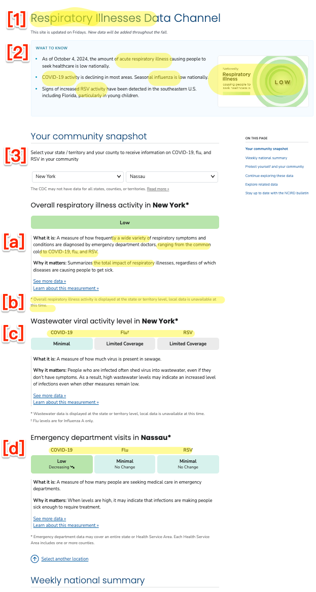
Figure 1: (a) “Respiratory Illnesses Data Channel”
The New Weekly “Respiratory Illness” Metric: Useless
In Figure 1 (a) at [1] and [2], we see that the “Respiratory Illnesses” of Covid-19, the flu, and RSV are all lumped together into a single “National” metric. There have been other phrases for this lumping (“tripledemic,” “pan-respiratory model“) although Tin settled on “topline figure.” But who does this “topline figure” help, exactly? It certainly doesn’t help an individual hospital estimate their potential patient load; for that, the hospital would want a metric for their catchment area[B]. Nor does it help the individual “American” Tin says the metric is designed to help (“people,” Ritchey calls them) . Michael Hoerger comments:
Quite unfortunate with many health systems lumping together Covid, cold, and flu based on this sort of guidance.
Imagine telling children whether it's okay to play outside based on the combined total of stray tigers and housecats on the loose. Not very discerning.
— Mike Hoerger, PhD MSCR MBA (@michael_hoerger) October 4, 2024
Nosology: Respiratory (Wrong)
Nosology is the branch of medical science that deals with the classification of diseases (example diagram). In Figure 1 (a) at [1] and [2], we see that CDC has classified Covid-19 as a “respiratory illness.” They’re wrong. From World Health Network:
COVID-19 is not primarily a respiratory infection. This virus can cause a systemic disease with far-reaching effects on the body, particularly the blood vessels. Once SARS-CoV-2 enters the body, the virus can affect the endothelial cells that line blood vessels, causing inflammation and damage. This widespread endothelial damage leads to clotting and has significant implications for organs and systems.
…The virus enters primarily via the respiratory tract, but then goes on to infect your organs across your body via your blood vessels. You may only feel the effect that the virus has on your respiratory system and a general feeling of malaise or fatigue during your acute-stage infection. You may be misled, based on these initial symptoms, into believing the false comparison that this virus is as gentle as your last cold. However, the virus is also attacking your other organs…. And this is where the challenge lies for you: just like with any life choices that you make to preserve your health, you cannot trust how you feel during those days or weeks following your initial infection as a reliable metric of what health consequences have truly transpired from that infection. Instead, relying on the thousands of scientific publications illustrating the damage that COVID does to your long-term health is painting a more accurate portrait of your health following your COVID experience.
Messaging: Minimization
Again, as you can see in Figure 1 (a) at [1] and [2], CDC groups Covid-19 with the flu (and with RSV, a pneumovirus). That makes it extremely easy to jump to the conclusion that “Covid-19 is just a flu,” as social norms and wistful thinking drive many to do. Here is a comment responding to Tin’s tweet about his article:
Covid is officially the FLU! Quit trying to label it separately!
They still testing for it in poop? 😂 stop your scare tactics. We all got the memo.— Ccm (@CcmDisanddat) October 4, 2024
One of many, and many more to come. In fact, Covid-19 is not “the flu” (not least because Covid-19 is a Coronavirus, and the flu, unsurprisingly, is an influenza virus, RSV being a pneumovirus). Not only is Covid-19 not the flu, it can be far worse than the flu. From Infection Control Today:
A recent article by Yan Xie and colleagues presented strong data that COVID-19 is much worse than the seasonal flu.
The researchers observed increased rates of delayed and long-term death and disability in US military veterans who were hospitalized with COVID-19 as compared to those hospitalized with seasonal influenza. The COVID-19 group of patients had a 51% higher chance of death over an 18-month follow-up period.
These figures are borne out by CDC’s own data:
"It's just the flu!"
No, unfortunately, it's not.
Even at the height of flu and RSV seasons, covid causes more deaths than flu and RSV combined. https://t.co/USI1z5j6zb pic.twitter.com/ghqS4TySSv— Noha Aboelata, MD (@NohaAboelataMD) January 16, 2024
From Katherine J. Wu in the Atlantic, “Why Are We Still Flu-ifying COVID?“:
In 2023, COVID hospitalized more than 900,000 Americans and killed 75,000; the worst flu season of the past decade hospitalized 200,000 fewer people and resulted in 23,000 fewer deaths. A recent CDC survey reported that more than 5 percent of American adults are currently experiencing long COVID, which cannot be fully prevented by vaccination or treatment, and for which there is no cure[C]. Plus, scientists simply understand much less about the coronavirus than flu viruses. Its patterns of spread, its evolution, and the durability of our immunity against it all may continue to change.
And yet, the CDC and White House continue to fold COVID in with other long-standing seasonal respiratory infections. When the nation’s authorities start to match the precautions taken against COVID with those for flu, RSV, or common colds, it implies ‘that the risks are the same,’ Saskia Popescu, an epidemiologist at the University of Maryland, told me. Some of those decisions are ‘not completely unreasonable,’ says Costi Sifri, the director of hospital epidemiology at UVA Health, especially on a case-by-case basis. But taken together, they show how bent America has been on treating COVID as a run-of-the-mill disease—making it impossible to manage the illness whose devastation has defined the 2020s.
Personal Risk Assessment: Difficult
If I, as an American, one of the people, wish to make a Personal Risk Assessment for respiratory illness, I can do so using the State and County dropdowns shown in Figure 1 (a) at [3] (where we can also see the nosological error of classifying three different illnesses identically at [a], [c], and [d]). From the User Interface/User Experience (UI/UX) standpoint, these dropdowns leave something to be desired.
First, per [b], county data may not exist at all (I got New York for mask-banning Nassau County). This makes the dropdowns almost useless, since upstate New York may have completely different infection levels from Long Island (or Queens, home of infection entrepôt JFK).
Second, the data is (one hopes) current. But without history, the data is nearly useless. If I want to adjust my behavior, I need to have some sense of what worked in the past, where and when. Suppose, as at [a], Covid-19 is “minimal” on October 8, 2024. How about the same date in past years? What is October 2024 like, relative to October 2023, 2022, 2021, or 2020? (And don’t give me you don’t need to know, it’s seasonal”; see below). What we really need are charts going back to the beginning of the pandemic (like Biobot’s, or those few remaining charts CDC has not yet managed to dumb down).
Third, the use case that has come up for me most often is not “What are my local conditions?” but “What are the conditions when I wish to travel?” (on holiday, perhaps). For that, what I need is the data for my departure airport (e.g., JFK/Queens) and my arrival airpot (Los Angeles/LAX), airports presenting many dangerous crowded, closed, close-contact spaces. A dropdown presents three problems: I must enter the data twice in the dropdowns, once for departure, once for arrival, and in selecting the arrival, I erase the departure. Therefore, I must remember the first to compare it to the second, violating the key UI/UX principle: Don’t make me think!. Finally, the granularity is not sufficient unless it’s at the county level (Queens, not New York City, let alone New York State). A map with data down to the county level, like we used to have before CDC dumbed maps down to pastel-colored states, would solve all three problems, and make arrival and departure data visible at a glance. Interestingly, a Tweet from Tin presents a map, but that seems to have been cut from the version that shipped:
Long in the works, the @CDCgov has officially launched its new "acute respiratory illness" levels
Based on ER data, we now have a topline figure reflecting risk of COVID-19 combined with other germs that spread through the air https://t.co/AKuj0aexDN pic.twitter.com/cewkXHdqni
— Alexander Tin (@Alexander_Tin) October 4, 2024
(The URL in Tin’s tweet is the same as Snapshot, but there’s no map now. And this map must have been a rejected draft, because it has purple for Very High and Red for High, instead of CDC’s stupid, “soothing” green pastels.)
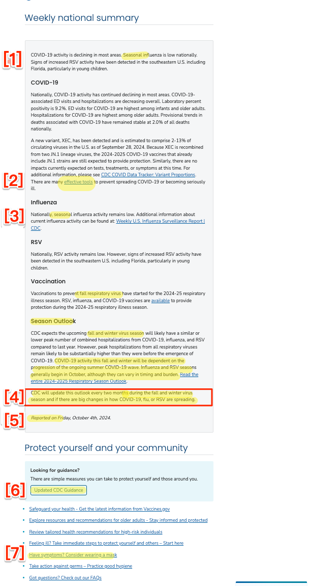
Figure 1: (b) “Respiratory Illnesses Data Channel”
Paradigm: Seasonality (Wrong)
As we see at Figure 1 (b) [1] and [3] (paragraphs one and four), CDC treats all three viruses as seasonal, and groups them all under that rubric ([3] at paragraph four) as occurring during the “fall and winter virus season.”
But Covid is not a seasonal virus. From Wired (2023):
But experts on the front lines and doing data analysis say it’s too soon to declare that Covid has achieved seasonality. Looking back over the previous three years, they do see patterns: a spike at some point in the summer, such as the arrival of the Delta variant in 2021, and a spike sometime in the late fall or winter, such as the Thanksgiving surge of Omicron later that year. But those spikes haven’t occurred at the exact same time from year to year, and it’s possible they didn’t all arise for the same reasons.
From the World Health Network again (2024):
Unlike many of the respiratory viruses that you are accustomed to, COVID is not seasonal. You can enjoy a COVID-19 infection anytime during the year, as COVID-19 surges can manifest at any time…. COVID waves are not merely a fall or winter phenomenon, nor do they follow any other predictable seasonal pattern.
From the BBC (2024):
For the scientists who monitor how SARS-CoV-2 is evolving and changing, it is still almost impossible to predict when the next strains of note will emerge. While most common respiratory infections like influenza or Respiratory Syncytial Virus (RSV) follow seasonal patterns, surging during the autumn or winter months before abating in the spring and summer, Covid-19 is yet to settle into such a distinctive cycle.
In the wake of the latest summer outbreak, it remains to seen whether Covid-19 will ever become a truly seasonal virus, and if so, how long that will take.
Even CDC’s infamous Director Mandy Cohen admits Covid is not seasonal. From a CDC livestream at the National Foundation for Infectious Diseases (September 25, 2024):
[COHEN:] we’re seeing summer waves and it’s telling us that COVID is not confined to the winter like flu and RSV are, it can be a year round disease, even more important for us to stay updated on our vaccine, and doing it now ahead of the winter, when we do expect more hospitalization and more death from both COVID and flu, now is the right time to get vaccinated.
(So why isn’t “now” always a good time to mask up?)
From Science News (2024)
Being able to mark COVID-19 season on the calendar would be nice. At least then we’d know if we need to don masks along with our hats and gloves or with our beachwear. And there wouldn’t be so much guesswork in timing vaccinations.
For now, though, the coronavirus is on its own ever-changing timetable. Whether it eventually settles into a seasonal virus may depend on us. The strength of our collective immune systems and our willingness to take precautions to not spread any illness to others may eventually wrestle it into seasonal submission.
I suppose “don[ning] masks along with our hats and gloves or with our beachwear” is what Mandy wishes to avoid at all costs, conflicting as it would with the vax-only policy of the Biden administration. And speaking of masks–
At [2] in Figure 1 (b), the link to “effective tools” — “https://wwwdev.cdc.gov/respiratory-viruses/guidance/” is, hilariously, broken (meaning the page wasn’t carefully proofread, so who knows what else is wrong). The correct link is “https://www.cdc.gov/respiratory-viruses/guidance/”
At [4] in Figure 1 (b), we see that the seasonal outlook” will by default be updated “every two months” but only during the “fall and winter virus season.” Surely that’s wrong on two counts?
At [5] in Figure 1 (b), we see the laughable assertion that this page has been “reported.” Reporters give sources, and I don’t see a single link to any of the data.
At [7] in Figure 1 (b), we come to this link: “Have symptoms? Consider wearing a mask.” Ignoring, with CDC, the fact that Covid-19 spreads asymptomatically, we come to Figure 2–
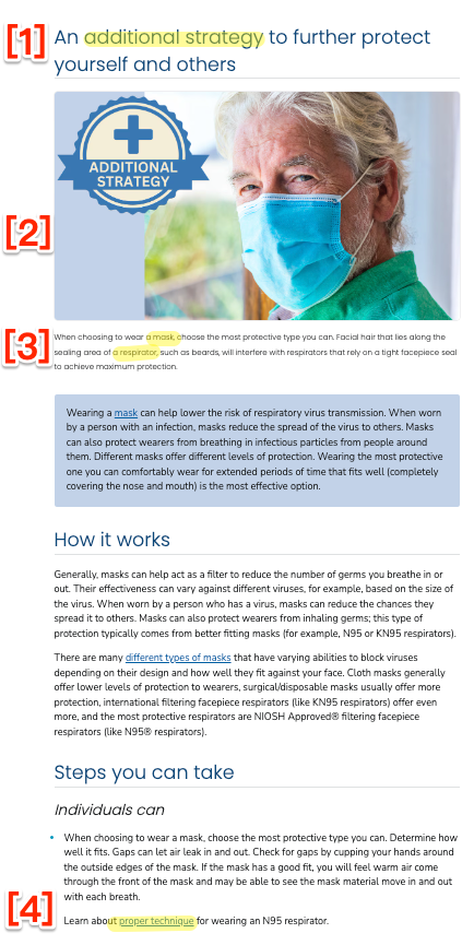
Figure 2: “Additional Strategies”
Non-Pharmaceutrical Interventions: Erased
At Figure 2 [1], we see that masking is an “Additional Strategy.” (Left unsaid is that if one goes to an airless doctor or dentist’s office with poor ventilation and no filters, it may be the only strategy; “additional” to zero, I suppose). At [2] we see that CDC, through its choice of graphics, endorses “Baggy Blues,” contradicting the text which urges, correctly, that respirators are more effective. Unfortumately, at [3], we see that CDC introduces the distinction between masks and respirators without defining either. And at [4] we see that CDC conveys the message that N95s are complicated and inconvenient by burying that information at the bottom of the page and requiring a clickthrough.
Back to Figure 1 (b) — taking this in logical, not physical, order — at [6] we come to this link “Updated CDC Guidance,” which contains the handy graphic shown in Figure 3–
Figure 3: “Respiratory Guidance Snapshot”
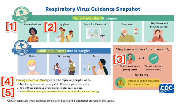
Buried at [4], we see that CDC is in fact advocating a “Layered Prevention Strategy” (the “Swiss Cheese Model“). Assuming that the layers are listed left to right in order of priority, we first see [1] vaccination (sorry, “immunization”) as a Core Strategy. Then, still in Core, insanely given that we’re talking respiratory viruses, comes [2] handwashing. (Boy howdy, does the handwashing faction have clout.) Trailing handwashing comes ventilation (opening windows). Insanely, masking (and respirators) are not in Core, but Additional. (I suppose that in every closed, crowded, close contact space, like a dentist’s office — or a store, ffs — CDC wants me first to try to get a window opened, and only failing that to mask.) And of course at [5] the reality of asymptomatic transmission is carefully ignored. On the bright side, we see at [3] that CDC now recommends staying home for five days (not one), although IIRC people remain infected and infectious for two weeks and more, so there’s still room for improvement.
Process: Politicized
Back to Alexander Tin at CBS:
Ritchey, who co-leads the team that coordinates data fed into the snapshots, said the CDC gathers experts from across the agency every Thursday to walk through the week’s data coming from hospitals and emergency rooms, wastewater sampling and testing laboratories.
“All those groups come together, talking through their different data systems and their expertise to say, ‘this is what’s catching my eye.’ And then that’s what we want to tee up for the public,” he said.
Sounds just like the deeply politicized HICPAC. If by two Thursdays from now these “experts” haven’t gotten links to their original data on this page, feel free to ignore it.
Conclusion
This post has gone on far too long — I didn’t think I would have to put on my yellow waders, but then I had to splosh back and get them — and so I can only sketch a few of the reasons why CDC might get so many things wrong in such a small amount of space.
The Semmelweis Reflex: “A human behavioral tendency to stick to preexisting beliefs and to reject fresh ideas that contradict them (despite adequate evidence).” This would explain burying the layered strategy, refusing to think through Covid’s airborne transmission, and forcefitting Covid-19 into the seasonal paradigm.
Fear of Hospitals. CDC’s Big Hospital HICPAC goons hate masks and, worse, respirators. This would explain burying masks deep, and respirators deeper.
Fealty to Big Pharma. Big Pharma is working on two-in-one vaccines that would include Covid. From BMJ:
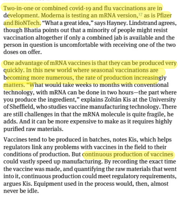
Two-in-one vaccines would be a profit bonanza for Big Pharma, and would leverage existing vaccination institututions, which CDC understands and controls (and which are, to an extent, still trusted)[D]. An additional reason for fealty is that Big Pharma is a significant funder of the (private) CDC Foundation, a large revenue stream independent of government funding. This would explain, well, everything.
POSIWID. Stafford Beer: “According to the cybernetician, the Purpose Of a System Is What It Does. This is a basic dictum. It stands for bald fact, which makes a better starting point in seeking understanding than the familiar attributions of good intention, prejudices about expectations, moral judgment, or sheer ignorance of circumstances” (in this case, a eugenicist outcome, or social murder). This too would explain everything. These explanations aren’t mutually exclusive, of course.
And so we see that CDC’s Community Snapshot, by conflating Covid-19, the flu, and RSV, caves to the minimizers (“It’s just the flu!”). We also can see that if you want to stay safe from Covid-19, you have to assume that everything CDC says is deceitful, including the Snapshot: CDC misclassified Covid-19 as a respiratory virus, and mischaracterized it as seasonal. The tools and data CDC provides are insufficient for personal risk assessment, even when the links work. CDC simultaneously advocates a layered strategy of prevention and removes a layer critical to preventing infection by an airborne virus: masks and respirators. And the metric upon which CDC justifies the production of the Snapshot — lumping together three different viruses — is useless. One can only hope CDC improves, but that seems unlikely.
NOTES
[A] Tin puts his reporter’s notes from CDC meetings up on Github!
[B] I suppose the “topline,” national metric might help the owners of hospital chains.
[C] I don’t want to suggest that other viral disases do not have “post-acute infection syndromes”‘; they do. But to my knowledge, none are as bad as Long Covid. Science advances, of course.
[D] I love the idea of “continuous production of vaccines.” Clearly the convenience of multiple injections, every year, for a lifetime, is far preferable to the inconvenience of, say, wearing a mask. Or missing brunch.


There must be some seasonality in absolute Covid prevalence even if not in trends in growth/decline, simply because in the summer children are not in school and people are outdoors for longer,I.e. you may see waves ebb and flow all year but you would expect the winter waves to be higher and/or steeper because the effectively susceptible population is higher (more time indoors) and mean reproduction number may be higher (more people indoors at any time).
I don’t recall seeing any papers arguing for or against the assumption so I had better, er, do my own research.
This reminds me of Alan Greenspan and other central bankers rejecting increasingly urgent warning from BIS economists, starting in 2003, of housing bubbles form in many countries because they had no theory, just data. Did you manage to miss that there was a big summer wave in the US? And it did not get worse when kids went back to school? There are fresh facts that disprove your thesis.
>but you would expect the winter waves to be higher and/or steeper because the effectively susceptible population is higher (more time indoors) and mean reproduction number may be higher (more people indoors at any time).
One possibility for the rising summer numbers could be with the extreme heat we are experiencing, more people are staying indoors for longer periods. Just a wild guess.
> There must be some seasonality
I think “some” is doing a lot of work there, as is “must be.” The fact remains that, as even Mandy Cohen admits, Covid is not seasonal as we have previously understood the term. (Perhaps it is seasonal in the sense that it can occur in all four seasons.)
I had to leave this on the cutting room floor, but in fact “seasonal” is such a wretched paradigm because it removes human agency from the equation and naturalizes infection. For example, if schools were properly ventilated, the “back to school” surge — let’s not call it the Fall Surge, mkay? — would at the very worst be significantly lowered. (We know this to be true because non-pharmaceutical interventions that worked so well in Australia in the beginning of the pandemic — until Gladys (?) destroyed them — also had the effect of eliminating flu, while they were in place.)
The political discipline behind presenting this message always amazes me — there are almost no breaks in Covid orthodoxy. The system of self-interest and sanctions maintaining it is strong. Someone constructed it, and someone is working to keep it going, and I want to get the names, beyond Biden. They will be the people we can apply the political pressure on. NNU’s HICPAC campaign is a tactic that we could scale up in a larger field.
Beyond Biden, Zients, and Cohen, it says something that most of the executants are kept obscure, which hints that they may be politically vulnerable figures. More public exposure could increase that.
Some of those names would be of the various political commissars who were inserted into the CDC over the past two Administrations or so.
And the political commissars at WHO who work to lie about the airborne nature of covid and who obstructed calling it a pandemic until they were very sure they had been able to turn it into one first, should also be named.
Is Gebreyesus one of those? If he was just someone’s visible human sockpuppet, whose sockpuppet was he?
> The political discipline behind presenting this message always amazes me — there are almost no breaks in Covid orthodoxy. The system of self-interest and sanctions maintaining it is strong. Someone constructed it, and someone is working to keep it going, and I want to get the names, beyond Biden.
Yes, that is in my view the biggest question in political economy today. I have to assume “the word comes down” from a layer above Biden, i.e. “the 1%.” But the mechanism of transmission is opaque to me.
The ultimate layer above Biden may be much smaller than “the 1%”. It may be the ” 1% of 1%” or the “1% of 1% of 1%”. It may be an even smaller number of actual people than that. If the number of people involved in setting the goals is small enough, they could all meet personally here and there, now and then, and transmit the goal among themselves. Their very highest subordinates could keep sending the goal downward through the various sub-levels of ” one per cent-ness”, verbally, by long-established Vulcan Mind-Meld methods, etc.
Once the goal has gone down far enough, then the message design engineers will design the messaging needed in order to encourage the message-eating masses to go along with the program.
If the goal is to reduce the world population by a few billion, and the OPOOPOOP don’t personally care which several billion persons do the dying-off, then little centers of counter-messaging like this blog won’t disturb them any. If little centers of counter-messaging like this blog threaten to break their counter-messaging through to the targeted billions, then the OPOOPOOP would try to shut all such centers of counter-messaging all the way down to head-off the rising effectiveness of the reality-based counter-messaging.
So its a race between the counter-messengers and the OPOOPOOP. Can the counter-messengers break their counter-messaging through before the OPOOPOOP becomes aware of the danger? Or can the OPOOPOOP get the counter-messengers shut down before the counter-messaging achieves breakout-breakthrough?
This is deliberate.
The people at the CDC know what they are doing, thinning the herd.
It’s “Go Die, profitably”.
I was talking about this with a neighbor who is in her early 60s. She is a cancer survivor, and until recently was good about avoiding exposure. Now, due to social discomfort, she no longer masks. She was using Xlear, but she just got her nose pierced, so she has stopped using it. At my pleading, she does take a claritin when she goes out (it was okayed by her doctor). She hasn’t caught covid yet, as far as she knows.
She tries to avoid reading dismal news, but she told me that she does come upon the information that I was sharing with her in the MSM, once in a while. We agreed that they are “not hiding it.” What is one to think about that? We are working on a worldwide, slow motion lobotomy, and it is right in front of our eyes.
My risk assessment is that it is always around everywhere, and that one infection is enough to permanently harm. I don’t need any charts for that. And at this point, with all the brain damage, I’m not sure that charts would help. My neighbor knows enough, and she doesn’t have to fight an employer to mask, but she just doesn’t anyway.
I still very much appreciate pieces like this one. It is a witness to what is happening.
Though I haven’t gone out of my way to track mask usage here in Brooklyn, I have noticed the steady decrease. Two days ago, in Whole Foods, only two. Yesterday, on the bus, two or three. In Trader Joe’s, besides myself and my son, only masks visible were on two of the cashiers.
And city policy has resulted in the tearing down or banning of most of the outdoor eating sheds. Fortunately, my favorite Japanese restaurant has installed a huge air purifier in the back and is happy to seat me close to it. It’s the only one I’ve heard of.
I get the occasional “Are you still” question. I’m happy being eccentric, but I do wonder about those who are not.
In Monterey county, CA, Mask usage is low but in my observation picking up a little bit. In the past week, Trader Joe’s and Costco, both with maybe 10% masked. Don’t shop often, but last month I saw nearly no one.
I’m still wearing N95 indoor public spaces.
” And even if not profitably, die. Just die, already, die. Die whether profitably or not.”
The purpose of a system is what it does.
The purpose of a snapshot is what it shows.
If the purpose is not stealth-facilitating mass megadeath murder over the years to come, then what other purpose is there? Profit? Really? When there are so much bigger things at stake? Like who gets to live and who gets to die at the societal and populations level?
This snapshottery is about so much more than profit.
And is laying the basis for lying about so much more than just covid. Or the ManBirdCow Flu.
This darwin filter will select for a population of high-bar selective-trust people.
Yes, this seems to be far, far big for profit to be the ultimate thing. Still it is surely motivating a lot of the participants, like employers, in the short term.
> It’s “Go Die, profitably”.
Rule #2 is “Go die.” The individual deaths don’t need to be profitable. The system(s) that produce them do, and are.
>The individual deaths don’t need to be profitable. The system(s) that produce them do, and are.
Unless you open a funeral home, or are an investor in Service Corporation of America, North America’s leading provider of funeral, cremation and cemetery services. They make their profit in the end. People getting taken from cradle to grave… sarcasm off. Or maybe not.
I hope every last one of these sociopaths rots in hell. But before they do, I hope they have to say good-bye to world from an iPad on a roll-stand.
I seldom write comments about covid because of the lack of solid facts and all the competing interests, not to mention the emotion of fear.
My personal strategy: I take responsibility for my heath and keep to the basic logical steps. I eat real food, exercise, live in gratitude and seek/practice opportunities to help others with kindness. I am not perfect but when I can complete a day of these things, I count it as success.
I’ve never taken a flu shot in over 64 years. I’ve never had the flu. Never gave them to my children and did my best to teach them the same strategies. We seldom get a cold.
I am also realistic. I will die. All living things die. The obsession with youth and long life (even if one is wasting away in a bed in a nursing home) is beyond me.
I take a very different tack due to loathing the people who are behind this; they are causing terrible sorrow. I don’t feel any gratitude at all (except occasionally towards particular individuals). I want to keep living so that I outlive the evil people who are encouraging people to get sick and die, and so that I can help their victims as I can. No kids, so I don’t have to set an example, thank goodness. I don’t care about being perfect, and I think my friends who are in nursing homes are leading lives well worth living. Agreed about the flu shots, however. Best wishes!!!
> I want to keep living so that
I have a lot of things I want to get done, some of which help others. So, I would like to be able to do that as long as I can. So I think “obsession with youth and long life” strikes me as a straw man.
Exactly. Old and sick people can help others, along with still enjoying life and being innately valuable. And there are things worth doing of many sorts, not just helpy stuff.
I see the “outlive the evil people” as having value in itself. Just as a way of making a point to the universe.
I don’t want to bash the original poster, but I don’t like passive acceptance of death imposed by bad people. And I don’t think “healthy living” matters much when there is a deadly respiratory disease in the air; it may help around the margins but not enough to really matter. Lots of “healthy” young people are dying.
Think of how there used to be so many 3 generation households in America, probably around the world. Built in daycare by the grandparents, passing along of history and knowledge of surviving in everyday life, elder care by the parents and grandkids as they got older. I may be naive about it though,
> I take responsibility for my heath
You would, then, put the handle back on the Broad Street Pump?
from WHN blurb,
“You can enjoy a COVID-19 infection anytime during the year…”
enjoy? What a bizarre choice of wording.
Covid infection was found early on to have an analgesic effect. And I think that that leads to addictive infection-seeking, and that that helps to account for the waves (analgesic wears off, then person seeks infection again). So the WNH blurb is perfectly worded for a mass killing.
If you have a link to any good studies on the analgesic effect, I would be curious to see.
The similarities to toxoplasmosis have been mentioned here a number of times, though the few studies I found on that were looking more at the angle of how a prior toxoplasmosis infection might affect risk of severe SARS-CoV-2, not the effect of SARS-CoV-2 on risk-taking behavior in general (I think that was a “more research is needed”).
https://news.arizona.edu/news/pain-relief-caused-sars-cov-2-infection-may-help-explain-covid-19-spread
Thank you!
> Enjoy
I assume irony (then again we recall the Taylor Swift fans who regarded Covid infection as a gift from mother).
What is the handling and disposal protocol for used masks?
See also System justification h/t Jessica WIldfire.